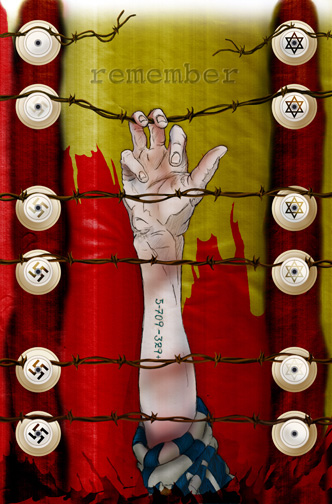
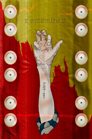
This is a poster I did for the Holocaust that came to mind after getting a nice in-depth book on the subject. It went through several modifications as I tried to capture several elements of the situation...ranging from boxcars, to buildings, to fences. In my mind had the idea for a family standing behind the fence with the fathers hand grasping the wire. I eventually stuck with the basic elements using strong symbolism and leaving the viewer with some questions to answer on their own.
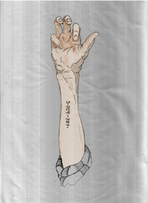
My original intention was to do the entire poster in either Freehand or Illustrator for a 'cut-paper' feel. As I went along I wasn't really happy with the look I was getting because I was losing the sketchy feel. I switched to using Photoshop to paint a drawing. I had a thin student pose in the class to get some quick sketches. After refinements I scanned the image in and the scanner gave me some interesting 'streaks' that I liked. I painted on multiple layers in overlay mode to get the desired effects and I was able to coax out charred fence posts from the background texture. Many elements were created in Freehand (symbols and ceramic wire holders)and imported in for additional shading.
The fading of the Nazi symbols from bottom to top show the weakening of their regime and the flipping of the Star of David shows the strengthening of the Jewish people as they rise to freedom. I took into account the tattooing element used to mark the Jews and used the most accurate number of lives lost that I could find to fill that position.
With all work, be it illustration or even more traditional graphic design items, I think it is important to tell a story. I tell my students if you can find the story it gives much more visual interest to the work. Even something as 'simple' as a logo can have much more visual depth if this is accomplished.
1 comment:
I like this one, it really makes you think of some things. Hannah
Post a Comment