
One of my first projects in college in 93' was a calligraphy book that we needed to illustrate and bind as a hardback. While the learning process was great (many props to Mary Grassel my prof) the product was pretty rough with regards to quality. Keeping the characters similar as well as 'inking' with limited tools and practice was tough. And since it was a calligraphy class the computer wasn't really an option.
Years later as I focused on my computer skills (02') I dusted off the book and reworked all of the illustrations while taking a special topic illustration class (props to prof Todd), using the old drawings as roughs. At the time I had learned much better the art of refinement and the need for reference photos, staged and otherwise, to help produce a quality product.
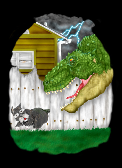
While students often feel awkward 'posing' in the beginning they soon get over it and can have fun in the process...(Derek Wetter would often be a 'prop' for my pics and I even conned him into climbing into an upright dryer...never needed the pic but thought it was funny...) I push the need for such items in class, hoping to help them get a jump in high school that I didn't have. I also learned what a powerful illustrative tool Photoshop was after picking up a 'Photoshop WOW!" book. The border was completed in illustrator and the rest of the items were painted after scanning in a sketch. I used multiple layers with different values of gray in airbrush mode at a relatively low flow...for highlights I set the mode to screen and for shading I switched to multiply...In the end the pencil sketch was completely removed.
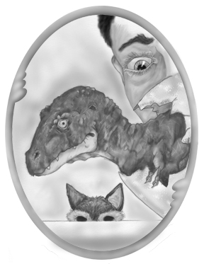
To keep the skin on the dinosaur from being so 'flat' I made a displacement map to help 'wrap' it. It is a subtle but effective difference that shows up even more in some of the other pics. My initial preference tended to be towards grayscale illustrations (Chris Van Allsburg of Jumanji fame is a personal favorite) but I also tried my hand at different methods of coloring. Colorizing the grayscale images left a weak 'watercolor' effect that was undesirable so I went with just painting in color from scratch. I used the same screen/multiply adjustments with the airbrush tool for highlights and shadows...carefully testing flow rates depending on the color so as to SLOWLY build up to the desired effect. (Many students tend to be a bit 'impatient' and start off with too heavy of a flow and go too dark or light too quickly).
The only other difference was the use of illustrator to outline the form. The outline was duplicated on two layers and was then used to A) sandwich in the colors and B)the pixels were locked off and painted to match the surrounding colors creating a 'smooth' edge as opposed to a sketchy quality...(more about this on a later post).
No comments:
Post a Comment