Saturday, December 15, 2007

IF: Backwards


I'll go with 'What is the proper way to walk into a proctologist's office?', Alex.

Monday, December 10, 2007

IF:Little Things


"You reckon you might have made those arm holes a little big???"

(In response to the competitive and sometimes catty underworld of child birthing...)

Friday, November 30, 2007

IF: Excess


"This is Bob Smith on location in Podunk, Oregon where young Timmy Tucker has fallen and scraped his knee...upon hearing the news, oil officials declared the event will cause gas prices to raise another 37 cents a gallon..."

I'm all for the free market...but when it is based on 'speculation' of events or raising prices for nonsense, I get a little miffed...

Friday, November 16, 2007

Monday, November 12, 2007

Scale(s)


(click for larger view)

As of late (and that being the summer on to most of this year) I've viewed the IF topics and done thumbnails but never really got around to the finals. I should have the process for this posted shortly (and it now is). The entire piece was done in Prismacolor...I learned my lesson with watercolors on illustration board...too heavy and you get peeling illos if you aren't careful, so I just bit the bullet and ran with it...


First step was doing some sketches on the back of envelopes, napkins, bulletins...whatever was around trying to work out general design issues of angles and such...then I went to locate some skulls of the dinosaur I was wanting to use...Once I located the appropriate critter I did a sketch of the skull and started fleshing out and working on the composition...my first thought was to have two dinos fighting but I thought that if I did a slightly battle scarred dino (the white eye is meant to be blind and there is some tearing around it)facing off against a turtle defending his turf I might be able to have at least a touch of sarcasm...


After getting the basics lined out I started doing the detail work of the dinosaur. I had to do multiple drawings to get the pose correct. I then transferred the finished drawing onto illustration board. This was detailed in an earlier post and kept me from having to redraw the same elements over and over or overworking the image on the illustration board.


My first big traditional media dino was my Yuck! pic. I left off the background intentionally on that pic as I wanted to have a clean focus on the dinos. My next traditional media pic was Blue T-rex...at first I was going to leave the background blank but decided I needed to get back in the swing of working on the composition as a whole. So I used watercolors to fill in large areas...of course I forgot to leave it flat and weighted as it dried so I got a nicely curled illustration board that is now seperating (my framer loves having to fix my errors). During the summer Steve of Flying turtle fame posted an item about drawing outdoors and I knew it would be a good idea at that point to do some studies to use one day...well this was the time to work on my most ambitious full scene...I knew there was going to be water involved (and had messed with distortion some on the earlier Gravity post) and had already purposed to use nothing but Prismacolor. I drew all the other items using light blue (see the Thin Blue Line post for the coloring process). I finally did some study of reflections and started throwing in items to help lead the viewer through...included is a rather obvious turtle and perhaps less obvious lizard in the foreground. The hardest part was reminding myself not to get wild with heavy burnishing on the trees so that the tooth of the illustration board would show through...and not overworking the items as they headed to the back in dealing with a bit of atmospheric perspective.

Friday, October 19, 2007

IF: Grow


Always make sure to address personal issues before you grow up...otherwise you could be running around in tights at odd hours and needing lots of therapy...

Monday, July 16, 2007

IF: Discovery


"We're having a hard time making a discovery as to what is causing your headaches...since nothing showed up on the x-ray we'll have to try an MRI...Now during the process we'll be injecting you with a dye made from shellfish...You don't have any adverse reactions to them do you?"

Saturday, June 30, 2007

Friday, June 22, 2007

IF: Camouflage


Zippo the clown's attempt to infiltrate the adjacent Royal Mime Academy was going perfectly...until he made a fatal error...

Didn't papaw say something about not taking any wooden rhinos...or was that nickels...


A few years back I wanted to try my hand at woodworking. My mom's husband graciously allowed me to use his shop (and probably cleaned up a mess or two). I drew out templates for 'seperate plates' on plywood, then glued together the needed boards. I chose the outer wood for the grain as I knew I would be using a semi-transparent stain. I used the templates to cut out the shapes and did a lot of sanding to curve the edges. I finally cut out some leather ears and added wooden button eyes.

My initial plan was to add rockers to it for stability...since I went for real wood it weighs a bit (about 40 pounds or so)...but I haven't gotten around to it yet...didn't I write something about procrastination on here somewhere?

Anyway, it was another good 'experience' and introduced me to some new tools and techniques...A reference book I purchased dealing with Intarsia by Roberts and Booher shows some REALLY spectacular samples...one of the authors is a real big-wig in the field and shows some top-notch work...like everything, if you do a web search you can find some super (as well as bad) examples...

Tuesday, June 19, 2007

Saturday, April 21, 2007

IF: Polar


Schizoology Quarterly clearly states that Bi-Polar Bears are easily recognizable by their distinctive markings...namely a straight-jacket...

Saturday, April 14, 2007

IF: Fortune


After baby Tyler swallowed the 10 carat diamond ring, the miner was assured the next load he dug would be worth a fortune...

Thursday, April 12, 2007

Why folks don't survive....COLLEGE...


Today while listening to a guest speaker at school (who talked about several issues facing students today) it crossed my mind again to do this post. The reality of the situation (in this country at least) is if you are looking into starting in the commercial art field you are going to typically need a degree (if you check the job listings the vast majority require a BA or BFA). And what is the point of a degree? Besides learning stuff and growing as a person/artist...it gets your foot in the door for a portfolio review for a shot at a job. The degree is one type of 'filter' used by employers.

That being said, there tends to be a high drop-out rate in not only college in general, but commercial art fields. I heard the stats for a local art college that showed their rate at about 54%. The schools I have been involved with seemed to be around the 50% mark as well. So why aren't these students making it? There are multiple reasons, but I'm going to focus on some of the main ones...maybe there will be some that see this and realize they need to get their bums in gear.

1. Lack of passion, drive, lazy...It is good to be passionate about what you do and you can develop or lose a passion for something. This is definitely an area where you want to be passionate. Without passion, when you run in to an obstacle you tend to quit or pout. This is a very competitive field and you have to light a fire under your britches to push yourself to rise to the top (drive). And then there is a bad case of the 'lazy'. Sometimes students lose or refuse to 'get a passion' because they simply want to be given everything and not have to work for it. This is a field where there is constant refinement and work to get things done and get them done properly. In our microwave society we want instant results. When colleges come and show off their best work, students often lose track of the fact how much WORK went into creating these items.

2. Not willing to pay the piper...In college you have the expectation that you will typically spend 3 hours of work out of class for every hour in class. Sometimes the college environment gets a student side-tracked or procrastination sets in (and we as artists tend to procrastinate...and if you get sidetracked or procrastinate that means to get something done in a quality manner you are going to have to burn the midnight oil. There have been countless times during finals where even when there wasn't procrastination you would have to spend 3 or 4 days with little to no sleep to get something completed. The attitude of those that fall to the wayside is usually...'I'll get to it tomorrow' and when they run out of tomorrows they think...'too late to do anything about it now'...and too often today students think that they should have a personal babysitter holding their hand through everything. It even shocks me when parents get upset with COLLEGE profs and want a piece of them because they won't baby-sit their kids.

3. Thin-skinned and not able to handle critiques...I blame some of this on high school. Sometimes there are teachers that are not qualified to give honest critiques (no art background) and everything is wonderful...or just because they get something turned in on time they get an A...this doesn't help a student as they head off to college. When a teacher 'rips' into their work (a lot of learning in this area tends to come from the negative...as the student learns to self-critique and mature in their capabilities the negative gets less) they too often take it as a personal attack. Instead of taking what is said and growing they curl up into a ball and throw a tantrum. I'll not lie...I did it in college a time or two myself in the beginning. But then as I got better I looked back and said, "Wow, how could I have defended that piece of pooh..."

4. Low standard for self and thinking that everyone should be okay with junk...There are many different styles out there and many different tastes. But well done is well done. I often say doing something simple doesn't mean doing something poorly. Students waiting until the last minute and throwing junk together or taking no pride in their work turn in low quality items and then get to (and should) hear about it. As I have seen some of these things it boggles my mind...it is like a job calls for a certain color of green, the student enters the wrong swatch and sends it to the printer and it comes out neon pink...so what if it could cost someone $20,000??? Or you design something the wrong size because of not paying attention to certain measurements...hours or days of work can be lost because it isn't always a matter of just scaling up or down. Student reaction? "Well your standards are just too high."

5. Poor art skills...(discussed in a previous post). Fine art skills are foundational. The computer is just a tool. Bad work and poor concepts can't be helped with a make cool button.

Again, this isn't an all-encompassing list but it does hit a few main problem spots. To be successful in college students need to:

1. Learn to motivate themselves and push to grow in a very competitive field. You can't settle for standing where you are.
2. Plan properly. No one is saying you are supposed to not have free time or play time. If you don't have this you will burn out. BUT you have to make sure you plan for both work and play.
3. Learn to critique yourself and listen when others critique. Get upset if you like but LISTEN and grow from what is said...your 'upset spells' will be less frequent and shorter as you mature.
4. Pay attention to what is being asked. If someone wants a design for Pepsi and you design the world's best advertisement for blue jeans...that gets you what???
5. The more you can do the better off you are. If you stink in a certain area push yourself to get better.

Finally, in college you can work the system but remember, grades aren't everything. There will be some schools that let you play that game because they are getting your money. But if you come out with a 4.0 and a bad portfolio...congrats...you just purchased a $40,000 wall decoration.

Monday, April 09, 2007

Friday, March 30, 2007

IF:SNAP


Sir Edmund Wimple had always enjoyed a quiet Saturday afternoon of teasing baby dragons...'had' being the key word...

ON A RELATED NOTE: Congrats to Kiley ($36,000), Jessica ($28,000), and Jared ($23,250) for their scholarship offers! Also congrats to former student Tyler for getting 3 illustrations selected for a show at Columbus College of Art and Design as a Freshman.

Please...Sit down...and make yourself uncomfortable...

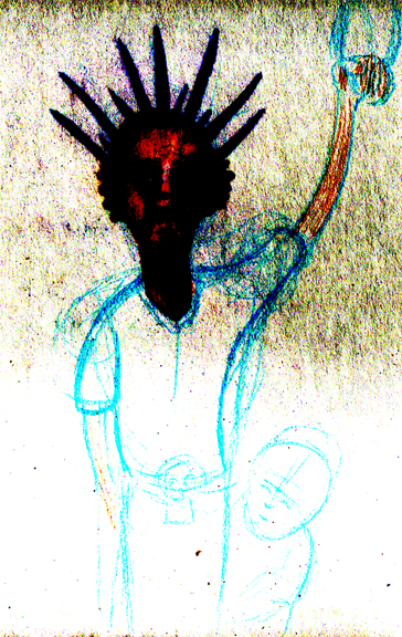
I always encourage students to step up and try something new...even if
it isn't something that we are focusing on in class (although I do try
to throw them acurve ball from time to time). Sometimes I am asked "How
do you do (fill in the blank)?" There isn't always a
straight-down-the-line answer to this question as there are often
multiple ways to do things. I think the real question that they want to
ask is "I've never done (fill in the blank) and I want it to come out
looking like it is going to hang in a museum on my first attempt...how
do I do it without a sense of failure and having that fear over my
shoulder the entire time?" The best way to do something you've never
done is...well to just do it. I realize (and try to give) basic
instruction for some 'new' things. ..But the reality is it is difficult
to explain how certain media will react under certain circumstances and
to get it to look nice...Explanation can never take the place of
experience...As artists we tend to be 'hands-on' and no amount of
explaining is going to give you the 'personal' touch of having done
something. You just have to push yourself out of your comfort zone and
see what happens. Sometimes it is going to be a major mess and
sometimes it is going to turn out okay. Either way you can always learn
and garner another 'tool for the trade'. I always enjoy and encourage
my students to give something a try in different media. The first pangs
of frustration are generally overcome with time and practice.


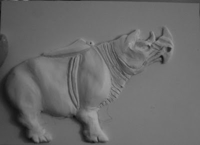
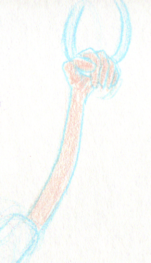
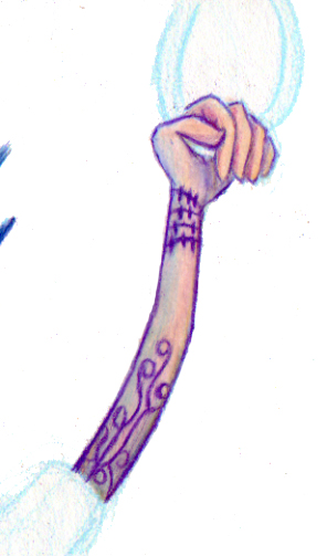
I had always wanted to do a 'relief' type illustration where the image protrudes from the picture plane as well as wanting to work on claybord. While going through an art history book I have I ran across a rhino vessel from the late Eastern Zhou Period. I figured since I was on a bit of a break I would give it a try and start to get a feel for both. I started by drawing out an outline of the rhino to use for a separate illustration. The claybord didn't hold the graphite like I thought it would so I figured I would use the outline as my template. I had purchased a small block of Super Sculpy for $1.77 and started to mold it to the panel.

Typically when you do a form on a panel you want to have anchors present to help hold the Sculpy in place. I had a horrible time in the beginning because I didn't do
this (I lacked a drill and was afraid if I just screwed in screws it
would crack the panel) and the head kept sliding around all over the
place. Once I started adding in the body it held in place a lot better.
I used some plastic clay tools to help etch in cuts and to curve the
form, but a lot of smoothing I just used my finger (Sculpy is also easy to smooth without worrying so much about gobbing up).


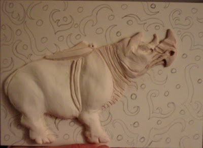
After I got the form down I fired it in my oven. Super Sculpy
has the advantage over traditional clay because it can be fired at a
lower temp in your oven, it doesn't shrink when fired, and it is much
less prone to holding air bubbles or cracking. After the baking I used
sand paper to clean up some of the lines and edges. I then found a
design from the same period and drew it in the background. I started to
ink it in and found I wasn't happy with the way it laid on top of the
panel.


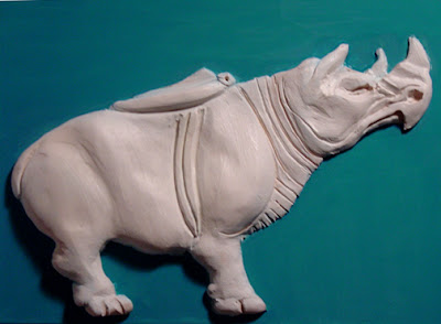
I finally decided to just use a flat color on the
back so painted it in with an acrylic ink. The real issue began when I
tried to paint the rhino. The original vessel was bronze,gilded with
gold and decorated with silver. I had some acrylic gold and silver ink
and thought it was going to be an easy job to finish up. And then chaos
had her reign. The Sculpy resisted the ink and the spray primer I had
wasn't a good match for the project...having previously used the primer
for another painting project I was afraid that I would go through all
of that work and then have to sand it down. The silver was left as a
watery grey schmoo so I tried to wipe it off with a rag and see how that
looked...bad. I ran the whole plate under water (which washed off all
of the ink...even the background) and spent the next bit drying and
repainting. Thanks to capillary action and not being able to get the
water molecules that remained in some of the cracks, the ink kept
'bleeding up' on to the piece. So a 5 minute job turned into a two-hour
battle of washing, sanding, drying and repainting. My final step will
be to add some design work and finish cleaning up the panel...although
I do like the contrast of the flat panel with the white form.

The important thing is that I tried something I had never done
before...wanted to scrap it 50 times while doing it...but completed it
enough that I LEARNED some things (good and bad) that can be used later
on down the road. It's not going to hang in a museum anywhere but I
think it can be touched up enough that I don't mind having my name
attached to it...

Monday, March 26, 2007

IF: I Spy...


My dad is retired CIA so we never get to play that game...as soon as someone gets out 'I Spy' he hangs them out the driver's side window and starts interrogating them at 65 mph...


"I spy...with my little eye...soooomethinnngggggg....WHITE!"

Friday, March 16, 2007

IF:Total


"It's not a total loss...you won't have to worry about making that appointment for your fungus anymore..."

Saturday, March 10, 2007

IF: Wired


After moving from New York to Oregon, Todd asked one of the locals if they could help him get wired...he was more than happy to help out...

Saturday, March 03, 2007

IF: Hide


Mother rabbit quickly realized she needed to switch from 'tan your hide' to 'spank your britches' when trying to get Melville to clean his room...

So...What's Your Story...


One of the best ways to approach any design problem
is to have a story. Why? Well, it helps with several potential design
problems and has the added benefit allowing you to 'talk' about your
work to a teach, professor, client or boss. The story you make up will
enable you to choose important visual elements as well as their
location. One needs to strike a balance of too much vs. too little
imagery. Too much can result in visual clutter and too little can lead
to 'dead spots' on the page (not to be confused with smartly used
negative space).

This was a college project that I enjoyed. Our instructor brought in a CD from one of his friend's bands called Basement Apartment. We listened to the music to get a taste for it (pretty mellow 'college' style music). The title of the single was
Learning to Fall. My story for this was two-fold. The first involved
the packaging...I played off of basement apartment by using a small
fridge to encase the cover. This took care of several areas because I
thought of theCD as parts of the appliance. The back showed the back
and allowed for nesting places for text. The front and inside (which is
the inside of the fridge) allowed for the logo to be placed as a
'product logo'...(if my memory serves correctly we had to design the
logo and I thought it turned out pretty well...but in my old age I
could just be making things up...)


The second part of the story involves the song
title. When I thought of 'learning to fall' I figured there was a kind
of irony to learning to ride a bike without training wheels. Because
there involves a lot of falling (in my case and every other child I've
watched) as opposed to riding in the beginning, I figured that was the
actual objective...learning to take the fall with as little damage as
possible. So I played up the idea of a financially poor little girl in
a city trying to do just that. There is a sense of feeling grown up
when the feat is accomplished (both the safe falling as well as the
actual riding) so I found a dress that is starting to be outgrown and
made a Polaroid image of the girl, bandaged knee, holding a wrench and
training wheel...and of course fridges make great places to
tape 'current' historical events... so it all played together...


The inside booklet was of a brick street (that was composited
together) that had bits of foliage shooting up through the cracks...and
as much as it seems ladies like to grow up and move off to the city
(maybe a bit of a stereotype but it fits the story)...every little girl
in the city would like to have a lot of nice grass to play on...and it
sure makes falling a lot easier...grass between the toes...etc...so
there are pictures that were laid out by the child on the alley street
and somehow she ends up in her make-believe place...so the original
picture is now empty and we see her shoes and where she has taken off
her training wheels lying in the grass photos.

Pretty much any type of design can benefit from such planning with a story. Even if the designer is the only person that knows the story, it can lead to a
'deeper' and more visuallyinteresting piece. When a viewer has an emotional reaction to a work they tend to enjoy it more and remember it longer.

Monday, February 19, 2007

IF: Gravity


It had been a great...even fun...day at work...but upon returning home to find his favorite pet expired, Death finally understood the gravity of his job....

Saturday, February 03, 2007

IF: Sprout


How farmers know when it's time to retire...

(new student interview is up on blankenstine unplugged...see my profile)

Gesture This...Part One


One of the most helpful...and unfortunately most overlooked...of all drawing skills is gesture drawing. Young artists tend to get stuck in contour drawing mode and their work tends to be disproportionate as well as 'stiff'. Breaking items down into shapes lightly is a big breakthrough and helps their work to improve. But one of the greatest tools is the gesture drawing. Quick linework attempting to capture the 'essence' of the item being drawn, with its 'mass', form, and gesture can help keep drawings from being stiff as well as helping to keep things in proportion. It can also help to work out 'visual problems' such as items receding in space.
There tends to be a mental block for some reason with students of all ages with gesture drawing. The idea is to have a direct 'connection' from the eye to the hand without 'thinking'...our eyes tend to 'study' objects in what seems like a random roaming pattern...bouncing all over...as opposed to in a top to bottom 'scanner' approach. As our eyes move our hand moves across the mass of the object. But once this method clicks with the artist it becomes and art form all in itself.
After getting the initial gesture down using a H pencil, the artist can begin to add detail and make corrections with a softer graphite. The gesture will then start to fade to the back and the drawing will have more of a life. As the renderer gets more adept at the skill, they will find out that when using reference pictures that the scale proportion will be pretty accurate. And when no reference picture is used, a mental image can be captured on the page that has action and is not so 'static'.

A good way to practice gesture drawing in the beginning is to take a magazine or print a variety of pictures and do multiple gesture drawings. Remember, quick and spontaneous with the eye 'bypassing' the brain and flowing through the arm to the pencil is the key.

Saturday, January 20, 2007

IF: Super Hero


They told Bernie wearing the Super Hero Sandwich costume only gave him the power to hand out coupons on the street corner for minimum wage...but when he saw the run-away bus come by he just couldn't help himself...

Thursday, January 18, 2007

Things That Go Bump In The Night: Part II


(Click to enlarge.)

After I drew the full body pic I knew I wanted to draw a closeup, more detailed pic. It took me until a couple of days ago (about 3 months) to get around to it...I debated about using colored pencil but decided to stick with graphite (2B and HB pencil) to stay in line with the first drawing and I knew it would be a lot quicker than with the color...plus I've always liked the look of graphite. One thing to remember, it is always a good idea to take a break from a drawing and go back to work on it with fresh eyes...and it also helps when working with graphite to use a piece of tracing paper under your drawing hand to keep from smearing the work so much.

Once I completed this I knew how to set the students project up. I pulled two descriptions of the chupacabras (cryptomundo.com and wikipedia), described one real weird looking animal, and pulled a description for a cryptid creature that turned out to be real (americanmonsters.com). The point...how descriptions, witnesses, and reality can often vary.
They are as follows:

Strange Animal One:
While a buddy and I was fishing we saw a strange animal swim underneath of us…It seemed like a cross between a fish, squid, and sea mammal of some sort. The skin was slick and ranged from a purple/pink to almost transparent around the ribs…there app
eared to be small spots on its nose’ like the coloration on a squid. And speaking of squid, that nose was like a composite of a duckbill and a squid’s tentacle…it almost reminded you of the form of women’s shoes during the middle ages. Its body was like that of a carp but with long flippers that looked like the nose…only slightly smaller. The eyes were set pretty high up on the head and were like two small black stones. Shortly behind the eyes was a single spine. The rear portion of the creature had two small fish-like fins, but the tail tapered off like a lizards, except it had small series of fins or feathers that lined the last ¾’s of it.

Strange Creature Two:
A lizard-like being, appearing to have leathery or scaly greenish-gray skin and sharp spines or quills running down its back. This form stands approximately 3 to 4 feet (1 to 1.2 m) high, and stands and hops in a similar fashion to a kangaroo. In at least one sighting, the creature hopped 20 feet (6 m). This variety is said to have a dog or panther-like nose and face, a forked tongue protruding from it, large fangs, and to hiss and screech when alarmed, as well as leave a sulfuric stench behind. Some reports note that the creatures have pronounced eye sockets, teeth, and claws.

Strange Creature Three:
A five-foot tall humanoid reptilian body, oval head and pointy chin, bulging red eyes, fanged teeth and long, darting tongue, no ears but with auditory holes. Small holes for nostrils and a lipless mouth. It had a thin neck and thin arms with three fingered hands that had sharp claws. Sometimes reported as having bat-like leathery wings.

Strange Creature Four:
Body the size of a camel with a similar face...slightly longer and narrower…leopard-like spots, and two, large, curving horns. Appears to be the result of the cross breeding of the two animals. There can appear to 5 such knotted horns on some of the animals. Long front legs and shorter rear legs. Long snake-like tail.

Students will then follow the creative process to do illustrations to be used for some Photoshop work and 'aged' soft book covers.

Things That Go Bump In The Night: Part 1


(As always, click the pic for a much larger view.)

A couple of months ago I was over at Cryptomundo.com looking over the posts. As previously stated, I like to visit there because I enjoy 'critters' and it always gets the imagination firing. Loren Coleman (really nice guy, Cryptozoologist (among other areas of expertise) and one of the many great gurus on the site...) was talking about a picture of a chupacabras that he had on a post and how there weren't many of the creature 'in action'. That got me thinking and gave me a good opportunity to draw.

With such creatures there are always eyewitness testimonies and the occasional sketch by the viewer. And then there are those that act like police sketch artists and take the information and draw from descriptions. Having just weeks before seen a show on National Geographic about chupacabras, I was amazed at how quickly natural phenomenon or explainable events were turned into stories of chupy attacks that spread across entire countries...and how varied the descriptions of the creature was. So I searched the net for written descriptions and drew based upon the following:

A lizard-like being, appearing to have leathery or scaly greenish-gray skin and sharp spines or quills running down its back. This form stands approximately 3 to 4 feet (1 to 1.2 m) high, and stands and hops in a similar fashion to a kangaroo. In at least one sighting, the creature hopped 20 feet (6 m). This variety is said to have a dog or panther-like nose and face, a forked tongue protruding from it, large fangs, and to hiss and screech when alarmed, as well as leave a sulfuric stench behind. Some reports note that the creatures have pronounced eye sockets, teeth, and claws.

I chose this version over the more 'alien-like' descriptions because it just seems much more believable and makes more 'sense' visually for the chance to be a real creature...although I'm not really buying this cryptocreature at all...bigfoot, sea serpents you can sell me on...but not this guy...(and the show did a good job of showing how insects could account for many of the freakish events)...

Next up...The Project...

Sunday, January 14, 2007

IF:Eighties


Bambi had the speedometer pegged into the high 80's when she caught a glimpse of her husband picking his nose...perfect time for a brake check...

Saturday, January 06, 2007

The Thin Blue Line


There are generally two techniques I use when prepping to draw with colored pencil. The first is described elsewhere on here (and on my Unmasked portion) using tracing paper to refine and transfer a ghost image for further drawing. Here I will describe a method I've seen on multiple occasions from cartoonists and animators hand has been used on all of my Illustration Friday (IF) colored pencil works.

I prefer to use Prismacolor pencils because of the blending quality. The only knock I have against these pencils is that sometimes in shipment they can get flexed or dropped and the 'lead' gets broken inside the pencil. When this happens and you go to sharpen them the 'lead' will just continue fall out of the wood casing. Other pencils I've tried are too hard and will not blend smoothly.


First I start with a light blue pencil to draw in the general shapes. Light blue generally does not transfer to scanners or copiers and is also used when marking mechanicals for layouts (such as magazines). In the first picture you can only see the blue lines I have darkened in heavily but in reality the entire figure is sketched in (the head has already been through the entire process and is pretty complete). Visually the light blue will disappear or can be easily blended into the other colors. When starting off with traditional graphite to rough in the shapes or leave a ghost image the problem is that the lead will often streak into your colored pencils. This will make your colors look dirty as opposed to vibrant.


This version shows the same pic with the levels adjusted so you can see the other lines.

As far as coloring as a whole...this is one method I use to help blend colors (and was used on all colored pencil drawings on my entire blog except where areas of fur are present)...I stumbled upon it the first time I used colored pencils doing a portrait because I didn't like the white patches from the tooth of the paper. I kept coloring heavier and heavier 'burnishing' the colored pencils in thickly and noticed that while doing this I could work in almost a painterly fashion blending colors. Now I use both methods depending upon the situation, as the softer touch is definitely better for a furry look.


I lay down a base color lightly.


I then go over the base color heavily with white. You can't tell a whole lot from this pic, but the white and base have started mixing and it provides a base to mix on top of...


I will then go over the arm again with the same base color or a slightly darker color. Then I will use white or a lighter color to start blending. I will finally hatch in blues or reds and use the light base color to blend again for a softer look.

This will build up a rather thick coat of color. After a while of working the area you might need to work lighter at times. If not you will start flaking off the color!

Finally, to add in details you just need a sharp colored pencil and you will be etching in to the thick layer of color you laid down.

TIPS:
This technique works best on illustration board.
Make sure to have a brush or to knock of your drawing board often as this method will leave a lot of colored fragments that can get smeared.
Have a couple of white colored pencils because you will burn a half a pencil up on a moderately size drawing.
If you are drawing 'tight refined' lines, spin your pencil after each stroke and it will help to maintain a sharp point without needing to sharpen the pencil.
After you work is complete use a fixative spray on the work. It will prevent wax bloom which can severely dull your colors.