Thursday, November 30, 2006

Why it's obvious what we have here before us is...

In the previous post I discussed a little about paleo-art and the guesswork that is involved. Some of it is educated guess work (such as ligament scarring on bones helping to show muscle attachment)...but some of it is just plain old make believe (such as when a single toe bone is found, a complete skeleton is reconstructed, and an art piece created showing what the creature was...and very often the fact it is based on a single small piece is a hidden from the audience).


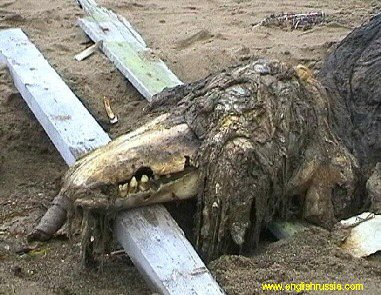
About a month or so ago while going over a cryptozoology website (www.cryptomundo.com if you want to check it out) there was listed a report that a Russian fishing vessel had found an unknown bit of skeleton that perhaps belonged to some sort of sea monster. Later several people came online to help identify the skull...but it was funny to see all of the people guessing as to what the creature might be...showing how our imagination can sometimes can get the best of us (which isn't always a bad thing).


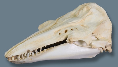
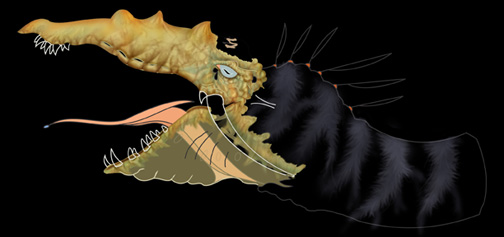
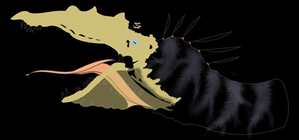
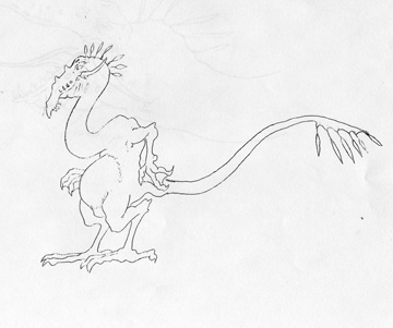
I read the general story to my class and then showed them a brief glimpse of the rotting corpse. I then gave each student a copy of a clean skull and asked them to 1) Render the skull by using basic drawing techniques 2)Flesh out the skull to depict what the head of the creature might look like 3)Draw a smaller version of their head with a body of what they thought the entire creature might look like. We mostly got dinosaur type pictures (which is what the Russians believed the creature to be.)


After they had completed the exercise I showed them what the creature actually was! It is hard to imagine that the real creature could 'come' from the skull presented...and if we didn't have a living example to directly compare the skull to I wonder what the scientists would would imagine it to be...


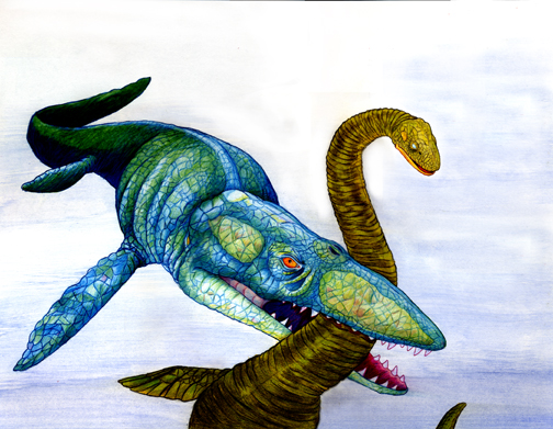
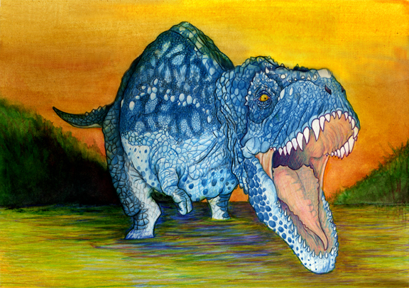
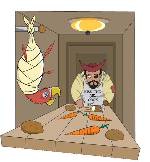
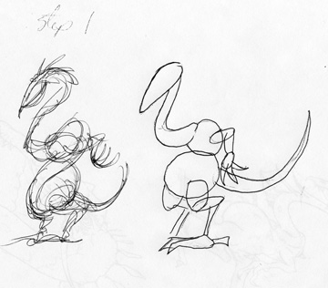
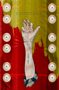
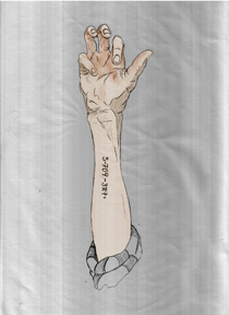
Since I was due for another drawing for my kids, and I was enjoying the computer free zone for a bit, I threw my hat in the ring on this project. I started with a quick gesture drawing of what I wanted to do, grabbed a big honkin' piece of illustration board, and went to work. I didn't like the plain white background this time so I used a splash of water color. I knew I would never be able to to use Prismacolor on such a large background ...too hard to try to match up the stroke work in sections and I would need about 75 pencils by the time the board 'chewed' them up...so it is a safe option for filling space quickly. I was also careful to keep the brush strokes 'visible' to add some visual interest.

Sunday, November 26, 2006

Flesh it out...


One thing I have witnessed paleo-artists doing is 'fleshing out' skeletons. They will take an image of a skeleton (drawn or actual photograph)and use tracing paper as an overlay to add muscles and then a second drawing detailing what they 'think' the creature looked like.


(Image from www.dakotadino.com/General_Info.htm as a sample image. I'll post the actual skeleton I used when I locate the picture.) Make sure to pick an image that is interesting for more drama after some initial practice on more static poses!

Now keep in mind that many fossils are very incomplete (some consisting of a single tooth or less) so there can be a great deal of guesswork into just figuring out what the skeleton looks like. Tie that into the fact that we haven't witnessed too many of the critters running down mainstreet, and you have a great opportunity to let your imagination run wild! Be careful to do searches on skeletons or skulls so as not to involve another artist's design! (More about a 'guesswork' exercise highlighting this aspect later that will leave you stunned and amazed...maybe.)

Here is another prismacolor rendering (used on dino and water) with a watercolor background. Watercolor can be a bit difficult to work with on illustration board as it will leave 'paper balls' on the surface if you work too fast saturating the top layers of the board. Makes sure to take your time with WC on this material! Cotton-rag paper is something I prefer to use when I know I will be using watercolor, as it will 'hold' the paint better (less blooming of the color)and eliminate the skinning of the substrate.

A tip that I picked up when using colored pencils: The pigment is 'held' in a waxy substance. Over time, this substance will leech to the top (known as a 'wax bloom') and dull the intensity of the work. To prevent this, spray the finished drawing with a fixative! This will help cut the wax bloom and keep your colors intense.

Friday, November 24, 2006

IF: Invention


The wagon forced us to carve the wheel...the sandwich opened the door to sliced bread...wedded bliss blossomed into prenuptial agreements...Yes, necessity is the mother to all invention...but alas...she is a harsh mistress indeed...

Tuesday, November 21, 2006

The shape of things to come...


I was talking to a co-worker and doodling...it all started with an upside down egg shape...within about three minutes that shape had 'turned itself' into an armadillo. What is the lesson? Again, always be ready to draw...second, shapes are your friend! In the beginning, most artists with natural talent tend to resist the 'break it down into shapes' or 'gesture' method. This usually results in work that suffers as 'deformed' while they try to do contour drawings and then add other stylizations for a more naturalistic appearance...there is no 'refining' stage.(By nature contour drawings always seem to be a bit distorted due to the techniques involved). Third...always feel free in the planning stages to let the drawing dictate itself! You can have a general idea that you work towards but be careful (and not afraid) to let the drawing have a life. Process and planning is important, but it can kill a piece if there isn't any 'breathing room'.

I eventually landed on the idea of...what if an armadillo was having a picnic to bring in ants to eat the food...so he could eat the ants!!! It was used in a series of drawings for my children's school.


While the original sketch sits in a pile of papers in a box, here is a brief sketch recreation showing the mere shapes I started with.

Having recently completed the Yuck pic...I thought I would return to the computer. But the more I thought about it, the more I realized I didn't want that 'sterile perfection' that can sometimes occur on the computer. I had to use multiple scraps of tracing paper to get the feet to look 'right' before compiling all the pieces and doing a final template (this will be shown in detail on a current project at a later date). The template was then burnished to piece of illustration board for coloring with Prismacolor. I used photoshop to figure out a nice background color and eventually used watercolor to there to complete the image.

Sunday, November 19, 2006

STEP AWAY FROM THE COMPUTER!!!


I almost imagine a bullhorn with police cars and weapons drawn on that title...In a previous post I declared the importance of hand rendering and the thought that computers are the magic tool to make everything better. Students are often in a hurry to get to the computers without worrying about the fundamentals. In college I was the same way. Thankfully I had instructors that pulled back the reigns and made us realize that computers are a tool...like a pencil or paintbrush. They do some things well and some things not so well. They can make projects go twice as fast or make them go twenty times longer than they should have. The truth is there are some 'looks' that you just can't get from a computer. A former student wanted to create the look of crumpled edges on a special type of paper. They thought the answer was to search for a tutorial and a filter in Photoshop. After 'letting' them search for about 20 minutes to no avail I suggested perhaps crumpling the paper by hand and scanning it in...a valuable lesson was learned by the student.

Those that I know that have been swallowed by the digital age often bemoan the fact that they don't get to do as much hand rendering. I can't think of a single person that works with computers that doesn't relish being able to get away from them for a while. The lesson...while computers can be great, sometimes nothing beats just sit
ting back and doing things the old fashioned way. Take the time to experiment with traditional media you've never worked with before or develop your techniques with media you are familiar with. But be careful not to abandon 'the old ways' or you'll tend to lose a little something you just can't capture with a computer.

For this work I was determined to do just this. I had only worked with Prismacolor slightly in the past and wanted to see what I could do as a more 'mature' artist. I started with sketches here and there, throwing together exactly what I wanted to do. I grabbed some reference pictures of only skulls from the internet and fleshed them out. ***WARNING*** When gathering references, especially for things we haven't seen running around for a bit (and only illustrations are available), be careful about stumbling on other's work for 'influence'. Let YOUR imagination and style come out...their stuff is already there.


After doing the sketches I ran some copies of certain parts and did color tests to see which colors I wanted to use. This is a smart time-saver and can keep one from ruining a work because the 'plan' and reality didn't mesh...prismacolor isn't the easiest thing to remove without damaging the illustration board and you can't just 'color over' a bad spot as there will always be a bit of a ghost image.

Typically when I work with the colored pencils I use them rather thick and do a lot of 'glazing/burnishing'. Here I tried to find a good mix, letting the texture of the illustration board help show the texture of the skin and fur but working with a heavy hand on the beaks and eyes. I liked keeping the background stark white to help the figures pop. I often do illustrations with one word catches and here we have 'YUCK'. A momma ptero didn't like have the salamander in her mouth but knew it was good for the kids. The salamander didn't like being in the slobbery mouth...and the kids, well they don't like anything that is good for them. I think I had brussel sprouts in my mind the entire time I was doing this...

Saturday, November 18, 2006

IF: Thanksgiving


Thanksgiving...400 miles out to sea...no turkey...something had to give...


Created in Freehand...

Thursday, November 16, 2006

BEWARE!!! DESIGN CREEP AHEAD!!!


It is very important that artists watch out for what is known as 'design creep'. Design creep is where a certain style is copied so much it seems to overtake everything! Next thing you know it seems like this is the only style in existence. And EVERY generation has it. What is wrong with copying styles??? NOTHING...if it is kept in perspective, you are already sound with the fundamentals of art, and you have YOUR OWN style.

As an artist it is important to develop multiple styles and abilities to be able to adapt to different situations. What if you only have one style and your client or employer doesn't like it?!? If all a pitcher can throw is a curveball, eventually people catch on and you become ineffective. If an artist can only do one style then they have a limited market that they can play to. And starting out it is important not to paint yourself into a corner.

I have seen students come through my class and all that they drew was anime characters. (In my day it was comic book characters from Marvel and DC.) Because they didn't balance themselves out, EVERYTHING they rendered had that style. Life-drawings, portraits, rocks, trees...all their work was 'tainted' by this style and they had a hard time being able to break away no matter what they did. Some still can't find their own style to this day!

Do I personally hate anime? No, it is another style of art and I have seen some exceptionally nice things done in this style. But keep in mind the following:

1. It is important to become sound in the fundamentals of fine art skills and design. This will make any styles you develop or copy all the better.
2. When colleges are looking at portfolios for scholarships they generally are turned off by such items. I have heard people that reviewed portfolios say that if they see comic book or anime characters then they are immediately set in the 'not gonna get a scholarship' pile. They want to see the sound fundamentals listed in #1 and then YOUR style and creativity.
3. Make sure to develop YOUR OWN style(s). Learn from other styles but remember, in highly competitive and creative fields it is often the unique style that grabs people's attention. The more you can do the more marketable you are!
4. If your goal is to become an anime artist then work towards that, but with realistic expectations. It is a niche market with millions 'practicing' the style. And the more people that are doing it the harder it will be to break into that area. In order to be great at it you need to know the fundamentals of art.

Again, if you want to practice ANY style, make sure to keep it in its proper place. Know the difference between a 'hobby' and what you can earn a living doing. (I know lots of people that work in the art field that enjoy painting, are fairly good at it, but they know they will probably never make a living doing it...but they can use it to enhance what they do make a living at.) Make long term and short term goals that are realistic and strive to do your best along the way.

Wednesday, November 15, 2006

If you can't accurately draw what you see...


If you can't accurately draw something that is right in front of you how can one expect to accurately render something that is in one's head? Drawing is 90% seeing...paying attention to subtle details...finding 'markers' to gauge proportions and making corrections to the sketch (instead of reinforcing the errors by merely outlining what you drew wrong to begin with).

If you are drawing something that you are visualizing, it is still important to be able to 'see' it clearly in the mind. Students are often resistant to life drawing and think that they do a better job drawing make-believe items. They often say this because someone that might be 'judging' their work can't climb in their brains and see how accurate they are or are not. Life drawings are more concrete when evaluating...are the angles correct? scale? proportion? values? As they struggle through these issues (if they are focusing and taking the issue seriously) they improve in both life and imaginary renderings.

But focused practice and practice tend to be two different things. If the teacher is the motivation, then their work tends to be several notches above what they do at home...and any improvement is usually temporary at best. Drawing is a skill and must be practiced to be maintained and improved upon! One of the best exercises for drawing is to take socks, twist them up, and spend about 5 minutes doing quick sketches. Trees also tend to be a great practice item. Again, it is important to pay attention to the details and practice 'seeing'. It is very easy to spot a drawing where someone is 'generalizing' and not drawing what is actually there.

More on the importance of life drawing and the dreaded 'design creep' in a later post.

Monday, November 13, 2006

Just DRAW!!!


It's funny sometimes to hear people that 'think' they interested in taking my class ask "do you have to draw...I hate drawing". Like my old prof Greg used to say...they think the computer has a make cool button but really it's just a $4,000 paperweight...and in the wrong hands this is definitely true...I say if you do poor work by hand you will probably do poor work on the computer (and it has mostly held true)...not being able to be at least proficient with drawing skills has always come back to bite people in the rear. Not that people can't learn, but there is definitely a needed focus and amount of effort that those lacking 'natural ability' aren't usually willing to put in.

I have never known a serious artist (commercial or otherwise) that hasn't had the same advice...keep a sketchbook. Draw like no one is looking (although people will always flock to you when they see you with a sketchbook in a public setting). But the only way to get better is to draw. The only way to stay sharp is to draw. The only way to keep your mind attuned to quality and attention to detail is to draw. The only way to save the endangered three legged otter of Norway is to draw. Thank goodness I attend a LOT of meetings and the like that gives me the chance to study folks or just throw something out to ease my mind. A good bit of advice I learned recently is to get a good sketchbook and actually use it like a scrapbook. Since I often draw on whatever is within my reach, (bulletins, notebook paper, napkins, etc.) this has proved invaluable. Often some of my favorite sketches are 2 or 3 minute studies that I did, working loosely and trying to capture the person or thing before they move on...And don't worry about being 'judged' in your sketchbook. This is you time...no pressure...relax and get lost in your sketchbook!

Saturday, November 11, 2006

Lessons Learned...


This was a project where we were required to do an 8 panel cd for a fictional graphic design software application that could do it all. It took several days to come up with a strong concept that would cover all the capabilities of the software. The creative process should be a time when problems are worked out and obstacles dealt with. Too many times students have a weak concept as a whole that might have one or two bright spots they are 'in love with'. The problem is that such efforts usually end in tragedy because errors 'appear' that no matter what you do just can't be fixed. So lessons that should be learned early are:


1. Follow the creative process. Do multiple thumbnails and try not to be satisfied with ideas that you think are great right off the bat. Sometimes artists can get a bit lazy and not really push themselves and great ideas are never fully realized. Often the best ideas are the least obvious (that is why they are so attention getting when they come to fruition). If 'artist's block' occurs...go off and do something else...the subconscious is often still at work and you might be doing something as exciting as folding socks when your brain wakes you up with THE solution. 'Digital Mosaic' came to me when I was about to doze off for the night after stressing for several days straight.

2. Visualize the final product from the beginning so that you have something to physically work towards...BUT...always be willing to adjust the piece. Let the work 'lead itself' and if the concept was strong it will survive and be all the much better. In this work I was trying to play up the digital mosaic too literally and thought I could use some of the filters to piece the visual imagery together with 'tiles'. After several attempts I knew this wasn't going to work out but was able to keep the core idea intact with the main images.

3. Have a reason for what you are putting in and establish 'relationships across the page'. If you are not careful you can end up just throwing stuff in to take up space...if no flow or relationship is established among the objects you end up with visual clutter. I tried to select objects and placement that were related to each other, to art, and to the media to be used. Note the use of flying creatures, grids, circles (real and implied), typography, and architecture. Sometimes less is more, but if a strong bond and flow is present then a visually rich work can be produced. There were also visual metaphors with regards to transformation and flight...but I'll spare you that!!! Remember, deep ideas (even if not explained) still add visual interest and come across to the viewer...so think deep.

4. BEWARE FILTERS. Filters aren't always bad, but the best use is limited and subtle. Smart use of a filter is often one that doesn't really stand out but accentuates the piece. If it screams filter it usually screams cheap. It seems with the advent of solid art classes popping up in high schools that art schools are starting to take notice. Hand rendered fundamentals are still (and should be) tops when consideration is given for scholarships...but strong well designed computer work utilizing the creative process and elements and principles of design can push you over the edge! Too often students try to 'hide behind the computer and often use filters to help them because their hand work is poor. In this work I found out that adjusting SMART BLUR can give a photograph a painterly effect! From here I used subtle transitions to make real pics flow to items that look painted. One other area a filter was used was the transition of the chameleon...besides smart blur I also patched a piece using a lighting effect for a bit of texture leading to the 'real' head.

5. Typography...text needs planned out and not just slopped in where it will fit. This area takes practice to get the feel but it is a bad idea not to plan out text placement when doing thumbnails and roughs. The result is often trying to force in text where it doesn't belong and too often work is lost because there isn't a workable solution no matter how much you shove it around.

6. For both digital and physical portfolios...save a copy with rasterized text or (in vector programs) text that is changed to a shape. This way you won't need to worry if using a different computer will mess up your text. The ad shown is missing the text because I didn't learn this lesson early enough (and it is eventually going to make a lot of work for me). Also, save a copy adjusted for print and a separate image adjusted for viewing on the web as the colors are sometimes worlds apart! And remember...save a copy flattened and a copy with all of the needed layers in case adjustments are needed later.

Friday, November 10, 2006

CLEAR!


After coming across Drawn.ca I noticed Illustrator Friday...thought it might be good exercise to keep the old brain cells knocking together!!! The topic was 'clear' and for some reason I had dead goldfish on the brain...and it fit perfectly. Hopefully next time I'll get to it before 9 PM Friday night!

Thursday, November 09, 2006

RESEARCH!!!...and don't forget to back up your stuff...


My senior capstone project that I chose to do was an illustrated children's book on the plagues of Egypt. (Thanks to Matt Cram and Greg Lyon for being such great instructors during my time under their watch and being flexible.) As previously stated, it is always good to have a story for what you are doing, no matter how simple. This one was already taken care of but it was a spectacular journey none the less and required more research than any other thing I've done before or since.

Each of the plagues was directed to a specific god(s) worshipped by the Egyptians and was really meant to discredit their power and authority. The first step was to find the specific gods and any visual/written information to base the illustrations on. Some were relatively easy, some not so much. The key was not to give up!!! Sometimes there is artistic license expected but usually the information is there to help with 'educated' rendering. Sometimes students will only dig as deep as the first few items to pop-up on the internet and give up or have little or weak info to go on. After getting what I needed over the course of several weeks I sketched out the gods (with my own spin while trying to remain accurate) and drew the items in Illustrator.

Along the way I found out great information about the daily lives of the Egyptians and how the plagues would have affected them...for instance, shaved heads with wax to hold on wigs (lice)...the Egyptians also had a furnace for sacrifices and used the ashes for their own 'purification' ceremonies (ashes from the furnace were scattered to the wind and became boils)...the biting flies carried disease that caused blindness (note the start of the hazing of the eyes). These items helped to come up with 'cut scenes' placed within the page as well adding visually interesting touches.

Sketches were imported into Photoshop and painted using the sketch as a basic template. No lines were visible (like in the Holocaust piece) and no outlining was done other than the importing of the Egyptian gods. Lots of layers and the same process of screening and multiplying with the airbrush tool.

So it is important to do solid research and get your hands dirty...and the best artists that I know tend to be the ones that do the most research and are 'students of life'...always trying to figure out what makes the clock work and taking it apart if need be to gain the insight.

The two-page section shows the general layout for the text page which brings us to the warning. DON'T FORGET TO SAVE OFTEN AND HAVE AT LEAST ONE BACKUP COPY! CD's are exceptionally cheap and portable hard drives are pretty cheap too. ALWAYS save a copy with all your layers for adjustments. At some point I wish to revisit this item but I didn't have backup copies of everything and a student accidentally reformatted my portable HD...I lost 4 years of work with very few items recovered!!! And some of the items I did recover were flattened and will need to be completely redone. But hey, they always say it gets better the second time around!

Wednesday, November 08, 2006

Processs is Key!!! Final


The final work and a graphite on illustration board headshot. The flat fill colors can be done in a vector program as well, but can actually hinder the shading process in Photoshop. The full body view was meant to be completed with the creature in water hunting for prey (hence no need for feet)...I plan on getting around to that at some point.

Process is Key!!! Part Four


After I have the entire piece filled with flat color I will clip corresponding parts of the outline and merge with the correct layer. For example, I will separate the beak outline and merge it with the flat fill color of the beak. This will help give me a crisp (although black) outline. Once I have the layers and outlines all merged properly (again the more layers the better I say for something like this) I can lock off the pixels on those layers. This makes it possible only to paint on areas with previously filled pixels. It is a simple matter to change the black outlines to the corresponding color. It may seem like a lot of work but the solid outlines make it worth it!

Last but not least, I use the dropper to pick up colors for adding highlights and shadows for a sense of texture and form. Depending on the color I will use the airbrush set on a lower flow (around the 3 to 5% rate). Building up slowly will help have a better effect than higher flow rates slathered in quickly. WACOM tablets are best for situations like this. And again...remember to LOCK OFF THE PIXELS and you don't need to worry about going outside the lines. The process is repeated until the piece is complete.

Process is Key!!! Part Three


After I transfer the drawing I will save a version that I can transfer into either Freehand or Illustrator. I prefer Freehand for outlining because of the ease of the Bezigon tool for adjusting curves (and expand stroke tends to work better because of this feature although it is not used here).

I accurately outline the drawing to transfer into Photoshop. Once there I will use a top layer outline to keep clean outlines and a bottom duplicate layer that I can paint in without worrying about messing up the crispness of the outline. I take the trouble to do the work in a vector program so I don't want to mess it up in the final product...so the outline sandwich is important. I use multiple in-between layers for coloring when it doesn't affect the outline. Once the flat colors are filled in it is good to save paths of all the flat colors!!! Once you start shading and highlighting you won't be able to just use the magic wand tool to get areas you might need to 'touch up'.

Process is Key!!! Part Two


After I get a general outline of what I am doing I can use tracing paper to keep things I like and change things I don't without having to redraw everything. I often see students that have problems with eyes or hands that think they have to redraw the entire project from scratch...or try redraw so much the end up with a glob on the page.

Here I wasn't happy with the head on the small sketch, so I roughed out a new one that looked a bit meaner. Then of course I use the tracing paper refining process until I am happy with what I've got. Tracing paper is also great to keep general proportions. The creature opening his mouth will have the same length of bill opened or closed. Tracing paper also allow the pivot area and angle to be correctly placed for an open mouth. If I don't like an I eye then I can leave that area blank and move a new piece of tracing paper around until I get an eye I am happy with. Finally I stack all of my pieces of tracing paper and draw a clean final version for transferring to the computer.

Process is Key!!! Part One


You can't build a solid house without a good set of blueprints. I push the importance of following the process and making as little 'repetitive' work as possible. At the same time I am not of the camp that goes overboard with gimmicks. For example, while gridding off a picture then transferring the grid to enable near duplicate rendering works...it isn't as impressive as just following basic drawing rules to draw a reference picture or item. Sure you can do it sometimes but doing this all of the time will only diminish an artist's skill.

The following is a method that I like to use SOMETIMES to refine drawings and is a good way for someone to build their drawing skills...along with some Photoshop goodness thrown in.

I came across a book during an illustration class (around 2003) that was a collection of creatures designed by the artist. What a great reason to make a book...just to push your imagination. So I started dabbling in this exercise in creativity. Again, during this time I was learning Photoshop coloring techniques and the product continues to be one of my favorite computer illustrations.

The first thing I did was a gesture drawing. I can never express enough the importance of 'learning' to do gesture drawings. Many students stumble at this process because it is not only new, but really pushes the 'eye to hand without thinking' side of the brain. But gesture drawings help teach one to 'see', to keep proportions correct, work out visual problems such as perspective and foreshortening, and add some life to a drawing that could end up too 'manufactured'. Plus a good gesture drawing is a nice piece of art on its own!

After the gesture drawing I will lay down a piece of tracing paper over the gesture and break it into shapes (or I might do this off to the side without the tracing paper depending on what I am trying to accomplish). You can even break the item into shapes over the gesture using a different colored pen or pencil.

Next I will lay a piece of tracing paper over the 'shapes'and start to refine the drawing into something more 'real'.

Tuesday, November 07, 2006

Tim's Pet


One of my first projects in college in 93' was a calligraphy book that we needed to illustrate and bind as a hardback. While the learning process was great (many props to Mary Grassel my prof) the product was pretty rough with regards to quality. Keeping the characters similar as well as 'inking' with limited tools and practice was tough. And since it was a calligraphy class the computer wasn't really an option.

Years later as I focused on my computer skills (02') I dusted off the book and reworked all of the illustrations while taking a special topic illustration class (props to prof Todd), using the old drawings as roughs. At the time I had learned much better the art of refinement and the need for reference photos, staged and otherwise, to help produce a quality product.

While students often feel awkward 'posing' in the beginning they soon get over it and can have fun in the process...(Derek Wetter would often be a 'prop' for my pics and I even conned him into climbing into an upright dryer...never needed the pic but thought it was funny...) I push the need for such items in class, hoping to help them get a jump in high school that I didn't have. I also learned what a powerful illustrative tool Photoshop was after picking up a 'Photoshop WOW!" book. The border was completed in illustrator and the rest of the items were painted after scanning in a sketch. I used multiple layers with different values of gray in airbrush mode at a relatively low flow...for highlights I set the mode to screen and for shading I switched to multiply...In the end the pencil sketch was completely removed.

To keep the skin on the dinosaur from being so 'flat' I made a displacement map to help 'wrap' it. It is a subtle but effective difference that shows up even more in some of the other pics. My initial preference tended to be towards grayscale illustrations (Chris Van Allsburg of Jumanji fame is a personal favorite) but I also tried my hand at different methods of coloring. Colorizing the grayscale images left a weak 'watercolor' effect that was undesirable so I went with just painting in color from scratch. I used the same screen/multiply adjustments with the airbrush tool for highlights and shadows...carefully testing flow rates depending on the color so as to SLOWLY build up to the desired effect. (Many students tend to be a bit 'impatient' and start off with too heavy of a flow and go too dark or light too quickly).

The only other difference was the use of illustrator to outline the form. The outline was duplicated on two layers and was then used to A) sandwich in the colors and B)the pixels were locked off and painted to match the surrounding colors creating a 'smooth' edge as opposed to a sketchy quality...(more about this on a later post).

Monday, November 06, 2006

Remember


This is a poster I did for the Holocaust that came to mind after getting a nice in-depth book on the subject. It went through several modifications as I tried to capture several elements of the situation...ranging from boxcars, to buildings, to fences. In my mind had the idea for a family standing behind the fence with the fathers hand grasping the wire. I eventually stuck with the basic elements using strong symbolism and leaving the viewer with some questions to answer on their own.

My original intention was to do the entire poster in either Freehand or Illustrator for a 'cut-paper' feel. As I went along I wasn't really happy with the look I was getting because I was losing the sketchy feel. I switched to using Photoshop to paint a drawing. I had a thin student pose in the class to get some quick sketches. After refinements I scanned the image in and the scanner gave me some interesting 'streaks' that I liked. I painted on multiple layers in overlay mode to get the desired effects and I was able to coax out charred fence posts from the background texture. Many elements were created in Freehand (symbols and ceramic wire holders)and imported in for additional shading.

The fading of the Nazi symbols from bottom to top show the weakening of their regime and the flipping of the Star of David shows the strengthening of the Jewish people as they rise to freedom. I took into account the tattooing element used to mark the Jews and used the most accurate number of lives lost that I could find to fill that position.

With all work, be it illustration or even more traditional graphic design items, I think it is important to tell a story. I tell my students if you can find the story it gives much more visual interest to the work. Even something as 'simple' as a logo can have much more visual depth if this is accomplished.

What better way to test something than with shakers.


As I figure out the parameters of this site I thought I would throw in a sketch and a final for a newsletter for...get ready for this...salt and pepper shakers. My goal is to throw in mostly sketches (my best sketches for ideas generally come during meetings...to help me focus on the speaker of course...and range from being done on substrate, shoe bottoms, napkins, and in the lean times...the back of my hand.) I hope to post (at the very least) a doodle or so every other day, with some finished items here and there. Some items may be familiar to those close to me so work with me.

As a commercial art teacher in Bizarro World I try to show the students the importance of the creative process...the need to draw SOMETHING daily...the importance of being creative within the confines given (some say color outside of the lines...I say it is okay to stay within the lines but how and what you do while you are there can and should blow people's minds as often as possible...and isn't nearly as confining as some want you to believe).