I almost imagine a bullhorn with police cars and weapons drawn on that title...In a previous post I declared the importance of hand rendering and the thought that computers are the magic tool to make everything better. Students are often in a hurry to get to the computers without worrying about the fundamentals. In college I was the same way. Thankfully I had instructors that pulled back the reigns and made us realize that computers are a tool...like a pencil or paintbrush. They do some things well and some things not so well. They can make projects go twice as fast or make them go twenty times longer than they should have. The truth is there are some 'looks' that you just can't get from a computer. A former student wanted to create the look of crumpled edges on a special type of paper. They thought the answer was to search for a tutorial and a filter in Photoshop. After 'letting' them search for about 20 minutes to no avail I suggested perhaps crumpling the paper by hand and scanning it in...a valuable lesson was learned by the student.
Those that I know that have been swallowed by the digital age often bemoan the fact that they don't get to do as much hand rendering. I can't think of a single person that works with computers that doesn't relish being able to get away from them for a while. The lesson...while computers can be great, sometimes nothing beats just sit
ting back and doing things the old fashioned way. Take the time to experiment with traditional media you've never worked with before or develop your techniques with media you are familiar with. But be careful not to abandon 'the old ways' or you'll tend to lose a little something you just can't capture with a computer.
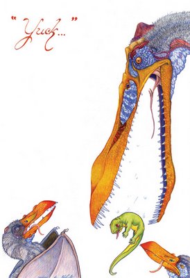
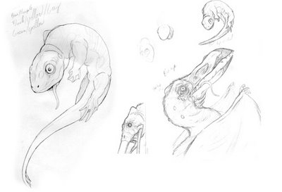
For this work I was determined to do just this. I had only worked with Prismacolor slightly in the past and wanted to see what I could do as a more 'mature' artist. I started with sketches here and there, throwing together exactly what I wanted to do. I grabbed some reference pictures of only skulls from the internet and fleshed them out. ***WARNING*** When gathering references, especially for things we haven't seen running around for a bit (and only illustrations are available), be careful about stumbling on other's work for 'influence'. Let YOUR imagination and style come out...their stuff is already there.

After doing the sketches I ran some copies of certain parts and did color tests to see which colors I wanted to use. This is a smart time-saver and can keep one from ruining a work because the 'plan' and reality didn't mesh...prismacolor isn't the easiest thing to remove without damaging the illustration board and you can't just 'color over' a bad spot as there will always be a bit of a ghost image.
Typically when I work with the colored pencils I use them rather thick and do a lot of 'glazing/burnishing'. Here I tried to find a good mix, letting the texture of the illustration board help show the texture of the skin and fur but working with a heavy hand on the beaks and eyes. I liked keeping the background stark white to help the figures pop. I often do illustrations with one word catches and here we have 'YUCK'. A momma ptero didn't like have the salamander in her mouth but knew it was good for the kids. The salamander didn't like being in the slobbery mouth...and the kids, well they don't like anything that is good for them. I think I had brussel sprouts in my mind the entire time I was doing this...

4 comments:
nice work!
computers are fantastic, but the pencil has soul.
ms. jd
excellent rendering, although it doesn't need the word in my opinion. I agree about returning to trad media.
And you can't get a splinter from a wacom pen...no danger no dice I always say...
About the word...at first it wasn't there but it seemed so 'empty'...so I gave it a whirl...
Post a Comment