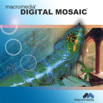


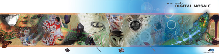
This was a project where we were required to do an 8 panel cd for a fictional graphic design software application that could do it all. It took several days to come up with a strong concept that would cover all the capabilities of the software. The creative process should be a time when problems are worked out and obstacles dealt with. Too many times students have a weak concept as a whole that might have one or two bright spots they are 'in love with'. The problem is that such efforts usually end in tragedy because errors 'appear' that no matter what you do just can't be fixed. So lessons that should be learned early are:
1. Follow the creative process. Do multiple thumbnails and try not to be satisfied with ideas that you think are great right off the bat. Sometimes artists can get a bit lazy and not really push themselves and great ideas are never fully realized. Often the best ideas are the least obvious (that is why they are so attention getting when they come to fruition). If 'artist's block' occurs...go off and do something else...the subconscious is often still at work and you might be doing something as exciting as folding socks when your brain wakes you up with THE solution. 'Digital Mosaic' came to me when I was about to doze off for the night after stressing for several days straight.
2. Visualize the final product from the beginning so that you have something to physically work towards...BUT...always be willing to adjust the piece. Let the work 'lead itself' and if the concept was strong it will survive and be all the much better. In this work I was trying to play up the digital mosaic too literally and thought I could use some of the filters to piece the visual imagery together with 'tiles'. After several attempts I knew this wasn't going to work out but was able to keep the core idea intact with the main images.
3. Have a reason for what you are putting in and establish 'relationships across the page'. If you are not careful you can end up just throwing stuff in to take up space...if no flow or relationship is established among the objects you end up with visual clutter. I tried to select objects and placement that were related to each other, to art, and to the media to be used. Note the use of flying creatures, grids, circles (real and implied), typography, and architecture. Sometimes less is more, but if a strong bond and flow is present then a visually rich work can be produced. There were also visual metaphors with regards to transformation and flight...but I'll spare you that!!! Remember, deep ideas (even if not explained) still add visual interest and come across to the viewer...so think deep.
4. BEWARE FILTERS. Filters aren't always bad, but the best use is limited and subtle. Smart use of a filter is often one that doesn't really stand out but accentuates the piece. If it screams filter it usually screams cheap. It seems with the advent of solid art classes popping up in high schools that art schools are starting to take notice. Hand rendered fundamentals are still (and should be) tops when consideration is given for scholarships...but strong well designed computer work utilizing the creative process and elements and principles of design can push you over the edge! Too often students try to 'hide behind the computer and often use filters to help them because their hand work is poor. In this work I found out that adjusting SMART BLUR can give a photograph a painterly effect! From here I used subtle transitions to make real pics flow to items that look painted. One other area a filter was used was the transition of the chameleon...besides smart blur I also patched a piece using a lighting effect for a bit of texture leading to the 'real' head.
5. Typography...text needs planned out and not just slopped in where it will fit. This area takes practice to get the feel but it is a bad idea not to plan out text placement when doing thumbnails and roughs. The result is often trying to force in text where it doesn't belong and too often work is lost because there isn't a workable solution no matter how much you shove it around.
6. For both digital and physical portfolios...save a copy with rasterized text or (in vector programs) text that is changed to a shape. This way you won't need to worry if using a different computer will mess up your text. The ad shown is missing the text because I didn't learn this lesson early enough (and it is eventually going to make a lot of work for me). Also, save a copy adjusted for print and a separate image adjusted for viewing on the web as the colors are sometimes worlds apart! And remember...save a copy flattened and a copy with all of the needed layers in case adjustments are needed later.
No comments:
Post a Comment