Tuesday, May 06, 2008

MEME: Teen Me...everything you didn't need to know about me but were afraid to ask...


After my daily visit to Drawn.ca I ran across a great stress breaker (and do I need one every chance I can get lately) from Dave at livejournal where you are supposed to draw your teen self or if you are a teen the future you...Kind of like Rugrats All Grown Up...or if you remember the dreaded Mork and Mindy days when Jonathan Winters hatched as an old man and the Orkians aged in reverse...

So here it is with all the vital self-deprecation I could muster:
1990 5 Feet 10 inches 135 Pounds 17 Years Old
1. The Spur Hair: While playing Jaws (at the age of 5 not 17) I fell down a flight of concrete stairs backwards...the resulting stitches give me a bit of an Alfalfa effect at times...
2. The Kind-of-Mullet: I deny I had one but there is one picture...I had my hair cutter tell me it was okay because I had a long neck...which resulted in great nicknames by my friends such as Snake Man or Giraffe Boy...but at least I still don't have it like some of them...and I never got it permed like some others I know...
3. The Glove: A pair was always kept handy because of....
4. The Possum Postal Service: You and three friends would find road kill...preferably possums...and deliver them at night to your friend's mailbox...and they had to be your legit friends so there wasn't any real trouble...it wasn't mean like mailbox baseball...you always knew who the driver was the next day by the mark left by the possum that was flapping against the side of your vehicle.
5. The Neon Orange Florida Gators Shirt: Apparently I was ahead of the curve with all the championships they have won recently...maybe they should play someone other than THE Ohio State that might actually give them a game...
6. The Reason I Didn't Wear Shorts Back Then: Chicken legs...
7. The Notebook: Always handy to draw with...there were several hundred drawings done of teachers and the like...of course I always did my work and graduated with a 3.0 GPA...hampered by Algebra II...new notebooks had to be guarded very carefully as we would draw quick bad pictures on every page of anyone's notebook that was foolish enough to be left unguarded.
8. Converse: The shoe of choice...until British Knights came out...Nike wasn't in the picture so much at the time.

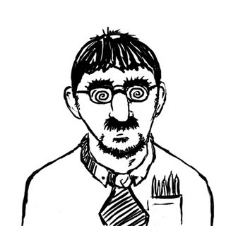
2008 5 feet 11 3/4 inches 175 Pounds 35 Years Old
9. The Hair: I still have the occasional Alfalfa...but at least, unlike my brothers or many other people in my age group, I have managed to keep my own hair.
10. The Goatee: I've traded my mullet for this??? But only because I still can't grow a real beard...and I have a lot of gray in it...which people in my age group with bad hairlines often point out. But it and my official 'collared shirt teacher wear' helps to hide my neck issues apparently, because I have to point it out for people to make fun of me.
11. No Glove: Now me and my kids are official snake hunters. We leave the dead animals alone and go for stuff that can fight back. And what self-respecting big game hunter uses a glove? Except that one time because the snake was a bit crazed.
12. Drawing Book: Absolutely have to have something to draw in or on...especially in meetings or college classes...which drives some people crazy because they think I'm not paying attention. My GPA is considerably higher for college...no Algebra II...
13.Drawing Pens/Pencils: I always have a couple in my pockets...but to date no problems with injury.
14: The Reason I STILL Don't Hardly Ever Wear Shorts: There was a lot of marching in the army but it didn't do anything for building muscles in my legs.
15. The Socks: They are either really ugly dress socks or white...which doesn't work with dress pants supposedly...but I say don't be peeking at my ankles...and all of my ugly dress socks are mismatched somehow at this point so white often wins out...

Saturday, May 03, 2008

Vector Art: Godzilla


(click to enlarge)

It took me a while to piece it together as time permitted, but I finally 'finished' the piece. (I have some small items to take care of for printing and might make some other small adjustments). Chris Leavens' awesome Saguaro Tortoise was the inspiration for doing the item in a vector program. One thing I enjoy seeing from other artists is their process from start to finish. I'll show the process on this later, but I urge other artists to show the process they go through to get to a finished piece. It provides great insight, shows the importance of proper planning, and can be a great teaching/learning experience. Often some of the best discussion have arisen on other artist blogs when they show how they got from point A to point Z.
KelMurphy just posted a sample of her process for an upcoming book...check it out!

Friday, May 02, 2008

Wednesday, April 30, 2008

Blowing Off Steam


One thing I continually get inspired by is going to such sites as Illustration Friday or Drawer Geeks and seeing all of the great work of other artists. I believe one of the real challenges for an artist (and why these sites are often so great) is making sure not to lose the creative edge when doing traditional work. Yes art fields provide plenty of opportunity for creative problem solving and not being bored to death like more 'traditional' jobs...(I once worked at a window factory for a week...God bless the people that can work an assembly line without going and jumping off a cliff)....but our field comes with its own little special set of stresses. Deadlines, producing quality work, resubmits on last second changes, feast or famine on freelance, having your mind 'on' a whole lot as your problem solving (at 3am, 4am, 5am), driving while drawing when a great idea hits (just kidding...maybe)...etc, etc, etc.

So as I visit such sites I think it is great that these artists put time and effort into producing some of the GREAT work they do just because. Non-artists or people new to the field sometimes miss out on the fact that creative folks need creative outlets or they face burnout just like anyone else. PLUS it often results in learning something that can be used later!

I also often run across posts that were made for some sort of contest, again, just for a creative break. The Vormator challenge (the above picture is from this event) was a contest where you were give 8 simple vector shapes to rotate, combine, overlap, etc to produce anything you wanted. You just weren't allowed to to alter the initial shape or to destroy the shape in such a manner that you couldn't see the basis for the creation.

Another great idea that I've seen floating around is traveling sketchbooks. Artists get together and pass around a sketchbook, sometimes even across the globe to compile different drawing styles. Check out the following links for a really good creative break...

Drawer Geeks
Illustration Friday

Steve's Flying Turtle moleskin exchange

Vormator Challenge
(Even though it is over you can still get the shapes and it is a great creative exercise).

Monday, April 28, 2008

Speaking of Bad Godzilla Flicks


As I was prepping to consolidate files I ran across and old college project. We were to make a movie poster and a CD for the soundtrack. Since I had just written the 20 page paper on Godzilla and the American Version had recently been released to astounding reviews (sarcasm implied) AND we were greeted with Disney's sudden influx of 'every show they ever did on ice' franchise...I asked my prof if I could throw it all together. I came up with a back story...Godzilla moved to New York, just wanting to be left alone...got a job as a plumber, married, etc. etc. But as a misunderstood monster he was hated...The government tricked his wife into divulging his one weakness...an allergy to tomatoes...and the fight was on.

I intentionally went for a bit of the bad photoshop look while trying to not go too bad...wanting to pull in all the cheese of the Disney shows via costume design as well as the whole feel...Note the expressions on the building and tomato..Derek and Brandi from class were kind enough to pose...one thing you can't do with out...willing subjects!

The project was a lot of work due to posing as well as finding images I could scan and piece together that would fit the roughs. On a side note, this is where a lot of students in school fail to adapt, not finding adequate resources or realistically judging quality of items they have to see if they can be used to produce a polished product. I believe I spent about 16 hours in 3 different libraries finding pieces that would work...

Friday, April 25, 2008

IF: Wrinkles


Bob couldn't help but notice there was something not quite right about his son...but he just couldn't put his finger on it...

Friday, April 18, 2008

IF: Primitive "Motivational" Device


I have to laugh as I continue to hear people wonder what has happened to yet another generation of 'lost youth'...While I don't believe in beating children, I do know that the pendulum started swinging to the rough side of town when discipline started to disappear from homes and schools...You used to be motivated to do or not do a lot of things back in the day because you understood that action or inaction could have immediate negative consequences that you didn't look forward to...today we have 'time out'...and prisons busting at the seams, low graduations rates, high drop-out rates,people medicated to no end, unable to fill jobs and importing labor because we don't have people capable of doing the work, and a victim mentality where the system 'understands' if you go out and knock off a liquor store at 3 am or shoot three of your friends...because the notion of negative consequences to actions has been lost...and if you think a timeout is a 'punishment' that works, ask any 16 or 17 year old that gets kicked out of school for a timeout what a punishment it is and how they dread it...

While there are people that take it overboard (and shame on them) you'll never convince me that it doesn't have a strong influence on determining the outcome of individuals and nations.

Monday, April 14, 2008

Godzilla in Progress

For at least a year I've threatened myself with doing a Godzilla pic. Who doesn't love a cheese-filled monster romp on a Saturday afternoon...well, lot's of people I suppose. In college, as they were redesigning Godzilla for the American version, I did a 20 page paper on Godzilla...special effects, symbolism, blah blah blah. It actually had some very interesting stuff...as a kid I wasn't that impressed with the original...but loved all the movies after where there were more monsters. As an adult I've flipped a bit. I'm okay with watching the one's after the original but they can be a bit painful at times. As I reflect on the original as an adult it was actually a pretty deep movie and makes the after movies look as silly as they actually are. I'm not going to get into the debate of the symbolism too much other than to say America did what it had to do at a very difficult time...and it sucks that innocent people were harmed or killed. Only crazy people enjoy war, but I understand that as the world is, sometimes that is the only option...as a veteran and knowing many others, war isn't fun or a treat.


Regardless, the American version came out and I will agree with others...it was a great special effects romp, and I liked the monster design...but it wasn't Godzilla. They turned him into a bit of a chicken and a her no less...but it brought up an interesting idea...as people continue to rehash famous characters, how do you redesign something so recognizable without going overboard. Think of all of the redesigns of Frankenstein's monster. So I decided to give it a shot. I started with several doodles on scraps of what I wanted to try as well as figuring out what media I wanted to use. Since it had been a while since I was all digital on a big project I figured what the hey. So I decided on Freehand...so if the final version turns out nice I can make a big poster without worrying about pixel issues of Photoshop.

What you can't see in the sketch is the buildings or Japanese zero placement...those have been sketched out but as they cover part of the image I wanted to hold of until the big cheese was rendered.


A sneak peek...more is finished but why give too much away at once...


The bad news about vector programs is if you don't have a lot of power, and you have a lot of points, everything can grind to a halt...luckily I have some really powerful computers at my disposal and here's to hoping that won't be an issue...considering how many points he is already taking up...and there is a LOT more to be done...I'm using plenty of layers in case there is an issue. Then I will be able to just save bits and pieces and import them into Photoshop to be pieced together when I determine a final printing size.

Friday, April 11, 2008

Friday, March 07, 2008

IF: Garden


Just a quick one as white death reigns down all around in the state of Ohio...

Wednesday, March 05, 2008

Groucho


The other night I was treated to seeing a bio on Groucho Marx. I did some doodles in my sketchbook of him as I studied his features. The really interesting thing was I noticed his nose was a bit fatter at the tip than I had always thought. But it was a great look into such a quick wit and the master of one-liners...but there was also a bit of sad stuff with regards to his life. It seems he was such a perfectionist and 'on' all of the time so much that it tended to drive people away after a while.

Anyway, the next day in class I was explaining some basics of Photoshop coloring. It is easier to think of it more as a 'painting tool' than a drawing tool. Most people may not see the difference but there is a freer mindset if you think of it this way...like oils, it can be a bit more forgiving filling areas and then going in and adding detail work vs. drawing with a fine point to cover areas. It was easy to 'blob' in spots and use the eraser to mold the shapes. After that it was just a matter of using the brush tool in screen for highlights and multiply for shading (both at lower flows). A lot of computer concept art is done this way and it can have some great results...(I also have a more refined color example of this way back at the start of this blog called skimmer...)

http://blankenstine.blogspot.com/2006/11/processs-is-key-final.html

Working in multiple layers and locking off pixels lets you 'stay in the lines' while also adjusting transparencies as needed to keep from having harsh blends when not desired. I chose a young Groucho for two reasons...I didn't have a reference available when I did it...and second...it is REALLY hard to screw up a Groucho drawing...get the hair, brows, and stache halfway correct and you pretty much know who it is...which is why so many people could mimic him...from Bugs Bunny to Alan Alda...a quickie but just a chance to stretch my legs back in the digital illustration realm since I've hit the traditional more the past few months...

Monday, March 03, 2008

IF: Leap 2


I know I already posted once...but sometimes funny (and I use that term loosely) observations hit me more than once...

Friday, February 29, 2008

IF: Leap


"As we bid farewell to Sir Edmund we know it isn't too far a leap to say he was all heart...but that's only because the hyenas were too full to eat any more..."

Monday, February 25, 2008

IF: Multiple


"What do I predict for my dad's record breaking jump attempt? Injuries...multiple injuries..."

Wednesday, February 20, 2008

Barratuna Header


After seeing so many great headers with images in them I thought I would give it a shot. This if for my barratuna site...Process was the typical...sketched the idea out...found a good reference of a tuna...redrew everything in my sketchbook to act as a template...went into Freehand and drew it all up...(as described elsewhere...Gradients are much better in Illustrator but being able to make good lines with the Bezigon tool and calligraphic strokes with the expand feature in conjunction with the Bezigon tool makes vector drawing about twenty times faster)...Imported it into Photoshop and did a couple of overlays. You can do lenses in Freehand that act as overlays, but unfortunately if you use too many you get the spinning wheel of death. One thing I noticed, as in real life...is the effect of water on color. My tuna actually has yellow eyes but the water layer tends to give a more realistic color blending.

Now let's see if I can get it to work!

NEW UPDATE: It seems that blogger and Mac's do not mix when it comes to posting headers! I moved to a (blahhh) PC and was able to post my header just fine!

Saturday, February 16, 2008

IF: Theory


"Well that's my theory about what happened to the cake...if you've got something better I'd be happy to hear you out..."

Friday, February 08, 2008

Friday, February 01, 2008

IF: Blanket


At 1:23 AM Florence made a blanket statement about their relationship...

Sunday, January 27, 2008

Friday, January 18, 2008

IF: Plain (w/bonus coverage)


Before she had put herself together in the morning Jane always felt kind of plain...


(click to enlarge)

Every year I do drawings for my kids' schools. This one I did for my daughter Sarah (yes, that's her in the corner with crazy glasses and underwear on her head). I'll detail the process later, but during the rendering I started throwing in IF folks whose work I enjoy...this made the composition a bit busy but such is life at times. Unfortunately I left some people out (actually a lot of people whose work I enjoy) because I couldn't find things in a short period of time that I felt would work okay in the scene.

Two less obvious ones are Amber, but she is super busy and never gets to participate in IF...although it would be great if she would...(aka Jane D'oh)...she's pretty awesome and has a keen wit about her which has always given me a good laugh...I couldn't incorporate the Monkey Peaches she grows in the can beside her microwave so I defaulted to the poi plant thing in the dog's flower box...I understand it is a felony to grow those things in Oregon so please keep her hydroponic lab under wraps.

I also started out to do this in color after planning on graphite, doing the linework and some of the painting, but knew it was going in the wrong direction and kept getting pulled to Detlef's site...who does pretty great graphite work. (check the barratuna site for links to these and others.)

So feel free to snoop around the pic and guess if you choose where some of the images come from...and I apologize for subtle issues due to the scanning and paneling of the work...

To ALL that contribute to IF, thanks for the inspiration and laughs!

LIST OF ITEMS (TO DATE):
Detlef-Rendering Medium
Jane D'Oh-Poi Plants
ValGal-Dog House
Pati-Godo Ball
Elizabeth Tofu Squirrel-Stuffed Animal
Steve Flying Turtle-Umm...The Flying Turtle
Ammon-Apple (from the apple project)
Amy Zaleski-Patterned Rug
Mac McRae-Hair Clips and T-shirt
Ms. Froggie-Seeing her wonderful work incorporating her kids I pushed mine in.

Monday, January 14, 2008

What is REAALLY Great About Being an 'Artist'


Every year about this time I get reminded of one of the greatest things about being able to draw and paint...I get to draw pics for my kids' schools...which is why my latest IF posts aren't the 'best rendered'...short on time and what time I do have goes mostly to them.

But there are moments when you run across another's kid and they ask you to draw them something when they see you doodling. I've been in hospitals in the emergency room waiting areas and had a long time to wait...and you see some poor sick kid or impatient one waiting and you can just doodle something and make their day. One of the defining moments in my life was when I was in 2nd or 3rd grade involving an elementary school teacher on cafeteria duty. I saw him doodling and I asked him if he could draw anything. He said he could draw most things. So immediately I threw out, "Can you draw Garfield? and a dragon? and a horse? and a soldier?" Of course I wasn't intending for him to draw those things but it was just a kid's way of thinking out loud. So he leaned over a cooler near us and I continued on a conversation with my friend not giving the other conversation another thought. Within a matter of 5 minutes Mr. Thomson slipped a piece of paper in front of me with Garfield, and a dragon, and a horse, and a soldier. It really blew my mind.

This drawing was done for a young lady that loved tigers. It didn't take that long and the smiles it got were great...I hope those of us that have such capabilities remember that...it NEVER takes that long...

Saturday, January 12, 2008

Saturday, January 05, 2008

IF: Are you (100 Percent) sure?


"Well...it was kind of dark...and there were an awful lot of pies flying through the air..."

Sunday, December 23, 2007

Saturday, December 15, 2007

IF: Backwards


I'll go with 'What is the proper way to walk into a proctologist's office?', Alex.

Monday, December 10, 2007

IF:Little Things


"You reckon you might have made those arm holes a little big???"

(In response to the competitive and sometimes catty underworld of child birthing...)

Friday, November 30, 2007

IF: Excess


"This is Bob Smith on location in Podunk, Oregon where young Timmy Tucker has fallen and scraped his knee...upon hearing the news, oil officials declared the event will cause gas prices to raise another 37 cents a gallon..."

I'm all for the free market...but when it is based on 'speculation' of events or raising prices for nonsense, I get a little miffed...

Friday, November 16, 2007

IF: Superstition


Bob's superstitious ways would prove to be his ultimate downfall...

Monday, November 12, 2007

Scale(s)


(click for larger view)

As of late (and that being the summer on to most of this year) I've viewed the IF topics and done thumbnails but never really got around to the finals. I should have the process for this posted shortly (and it now is). The entire piece was done in Prismacolor...I learned my lesson with watercolors on illustration board...too heavy and you get peeling illos if you aren't careful, so I just bit the bullet and ran with it...


First step was doing some sketches on the back of envelopes, napkins, bulletins...whatever was around trying to work out general design issues of angles and such...then I went to locate some skulls of the dinosaur I was wanting to use...Once I located the appropriate critter I did a sketch of the skull and started fleshing out and working on the composition...my first thought was to have two dinos fighting but I thought that if I did a slightly battle scarred dino (the white eye is meant to be blind and there is some tearing around it)facing off against a turtle defending his turf I might be able to have at least a touch of sarcasm...


After getting the basics lined out I started doing the detail work of the dinosaur. I had to do multiple drawings to get the pose correct. I then transferred the finished drawing onto illustration board. This was detailed in an earlier post and kept me from having to redraw the same elements over and over or overworking the image on the illustration board.


My first big traditional media dino was my Yuck! pic. I left off the background intentionally on that pic as I wanted to have a clean focus on the dinos. My next traditional media pic was Blue T-rex...at first I was going to leave the background blank but decided I needed to get back in the swing of working on the composition as a whole. So I used watercolors to fill in large areas...of course I forgot to leave it flat and weighted as it dried so I got a nicely curled illustration board that is now seperating (my framer loves having to fix my errors). During the summer Steve of Flying turtle fame posted an item about drawing outdoors and I knew it would be a good idea at that point to do some studies to use one day...well this was the time to work on my most ambitious full scene...I knew there was going to be water involved (and had messed with distortion some on the earlier Gravity post) and had already purposed to use nothing but Prismacolor. I drew all the other items using light blue (see the Thin Blue Line post for the coloring process). I finally did some study of reflections and started throwing in items to help lead the viewer through...included is a rather obvious turtle and perhaps less obvious lizard in the foreground. The hardest part was reminding myself not to get wild with heavy burnishing on the trees so that the tooth of the illustration board would show through...and not overworking the items as they headed to the back in dealing with a bit of atmospheric perspective.

Friday, October 19, 2007

IF: Grow


Always make sure to address personal issues before you grow up...otherwise you could be running around in tights at odd hours and needing lots of therapy...

Monday, July 16, 2007

IF: Discovery


"We're having a hard time making a discovery as to what is causing your headaches...since nothing showed up on the x-ray we'll have to try an MRI...Now during the process we'll be injecting you with a dye made from shellfish...You don't have any adverse reactions to them do you?"

Saturday, June 30, 2007

Friday, June 22, 2007

IF: Camouflage


Zippo the clown's attempt to infiltrate the adjacent Royal Mime Academy was going perfectly...until he made a fatal error...

Didn't papaw say something about not taking any wooden rhinos...or was that nickels...


A few years back I wanted to try my hand at woodworking. My mom's husband graciously allowed me to use his shop (and probably cleaned up a mess or two). I drew out templates for 'seperate plates' on plywood, then glued together the needed boards. I chose the outer wood for the grain as I knew I would be using a semi-transparent stain. I used the templates to cut out the shapes and did a lot of sanding to curve the edges. I finally cut out some leather ears and added wooden button eyes.

My initial plan was to add rockers to it for stability...since I went for real wood it weighs a bit (about 40 pounds or so)...but I haven't gotten around to it yet...didn't I write something about procrastination on here somewhere?

Anyway, it was another good 'experience' and introduced me to some new tools and techniques...A reference book I purchased dealing with Intarsia by Roberts and Booher shows some REALLY spectacular samples...one of the authors is a real big-wig in the field and shows some top-notch work...like everything, if you do a web search you can find some super (as well as bad) examples...

Tuesday, June 19, 2007

Saturday, April 21, 2007

IF: Polar


Schizoology Quarterly clearly states that Bi-Polar Bears are easily recognizable by their distinctive markings...namely a straight-jacket...

Saturday, April 14, 2007

IF: Fortune


After baby Tyler swallowed the 10 carat diamond ring, the miner was assured the next load he dug would be worth a fortune...

Thursday, April 12, 2007

Why folks don't survive....COLLEGE...


Today while listening to a guest speaker at school (who talked about several issues facing students today) it crossed my mind again to do this post. The reality of the situation (in this country at least) is if you are looking into starting in the commercial art field you are going to typically need a degree (if you check the job listings the vast majority require a BA or BFA). And what is the point of a degree? Besides learning stuff and growing as a person/artist...it gets your foot in the door for a portfolio review for a shot at a job. The degree is one type of 'filter' used by employers.

That being said, there tends to be a high drop-out rate in not only college in general, but commercial art fields. I heard the stats for a local art college that showed their rate at about 54%. The schools I have been involved with seemed to be around the 50% mark as well. So why aren't these students making it? There are multiple reasons, but I'm going to focus on some of the main ones...maybe there will be some that see this and realize they need to get their bums in gear.

1. Lack of passion, drive, lazy...It is good to be passionate about what you do and you can develop or lose a passion for something. This is definitely an area where you want to be passionate. Without passion, when you run in to an obstacle you tend to quit or pout. This is a very competitive field and you have to light a fire under your britches to push yourself to rise to the top (drive). And then there is a bad case of the 'lazy'. Sometimes students lose or refuse to 'get a passion' because they simply want to be given everything and not have to work for it. This is a field where there is constant refinement and work to get things done and get them done properly. In our microwave society we want instant results. When colleges come and show off their best work, students often lose track of the fact how much WORK went into creating these items.

2. Not willing to pay the piper...In college you have the expectation that you will typically spend 3 hours of work out of class for every hour in class. Sometimes the college environment gets a student side-tracked or procrastination sets in (and we as artists tend to procrastinate...and if you get sidetracked or procrastinate that means to get something done in a quality manner you are going to have to burn the midnight oil. There have been countless times during finals where even when there wasn't procrastination you would have to spend 3 or 4 days with little to no sleep to get something completed. The attitude of those that fall to the wayside is usually...'I'll get to it tomorrow' and when they run out of tomorrows they think...'too late to do anything about it now'...and too often today students think that they should have a personal babysitter holding their hand through everything. It even shocks me when parents get upset with COLLEGE profs and want a piece of them because they won't baby-sit their kids.

3. Thin-skinned and not able to handle critiques...I blame some of this on high school. Sometimes there are teachers that are not qualified to give honest critiques (no art background) and everything is wonderful...or just because they get something turned in on time they get an A...this doesn't help a student as they head off to college. When a teacher 'rips' into their work (a lot of learning in this area tends to come from the negative...as the student learns to self-critique and mature in their capabilities the negative gets less) they too often take it as a personal attack. Instead of taking what is said and growing they curl up into a ball and throw a tantrum. I'll not lie...I did it in college a time or two myself in the beginning. But then as I got better I looked back and said, "Wow, how could I have defended that piece of pooh..."

4. Low standard for self and thinking that everyone should be okay with junk...There are many different styles out there and many different tastes. But well done is well done. I often say doing something simple doesn't mean doing something poorly. Students waiting until the last minute and throwing junk together or taking no pride in their work turn in low quality items and then get to (and should) hear about it. As I have seen some of these things it boggles my mind...it is like a job calls for a certain color of green, the student enters the wrong swatch and sends it to the printer and it comes out neon pink...so what if it could cost someone $20,000??? Or you design something the wrong size because of not paying attention to certain measurements...hours or days of work can be lost because it isn't always a matter of just scaling up or down. Student reaction? "Well your standards are just too high."

5. Poor art skills...(discussed in a previous post). Fine art skills are foundational. The computer is just a tool. Bad work and poor concepts can't be helped with a make cool button.

Again, this isn't an all-encompassing list but it does hit a few main problem spots. To be successful in college students need to:

1. Learn to motivate themselves and push to grow in a very competitive field. You can't settle for standing where you are.
2. Plan properly. No one is saying you are supposed to not have free time or play time. If you don't have this you will burn out. BUT you have to make sure you plan for both work and play.
3. Learn to critique yourself and listen when others critique. Get upset if you like but LISTEN and grow from what is said...your 'upset spells' will be less frequent and shorter as you mature.
4. Pay attention to what is being asked. If someone wants a design for Pepsi and you design the world's best advertisement for blue jeans...that gets you what???
5. The more you can do the better off you are. If you stink in a certain area push yourself to get better.

Finally, in college you can work the system but remember, grades aren't everything. There will be some schools that let you play that game because they are getting your money. But if you come out with a 4.0 and a bad portfolio...congrats...you just purchased a $40,000 wall decoration.

Monday, April 09, 2007