After seeing so many great headers with images in them I thought I would give it a shot. This if for my barratuna site...Process was the typical...sketched the idea out...found a good reference of a tuna...redrew everything in my sketchbook to act as a template...went into Freehand and drew it all up...(as described elsewhere...Gradients are much better in Illustrator but being able to make good lines with the Bezigon tool and calligraphic strokes with the expand feature in conjunction with the Bezigon tool makes vector drawing about twenty times faster)...Imported it into Photoshop and did a couple of overlays. You can do lenses in Freehand that act as overlays, but unfortunately if you use too many you get the spinning wheel of death. One thing I noticed, as in real life...is the effect of water on color. My tuna actually has yellow eyes but the water layer tends to give a more realistic color blending.
Now let's see if I can get it to work!
NEW UPDATE: It seems that blogger and Mac's do not mix when it comes to posting headers! I moved to a (blahhh) PC and was able to post my header just fine!

11 comments:
Sorry, Brine -- I'm sure I'm not the guy you want trouble-shooting. However, I can truly appreciate what you've been up to here, and I am quite impressed with the diversity in which you can flex. From the new header to the graphite renderings and background stories, it's always an enlightenment for a teacher to see the work of another fellow teacher. thanks.
Hi Brian,
I wish that I could help but I have no clue. That is why I am still not using one.
Anyway....it looks great!
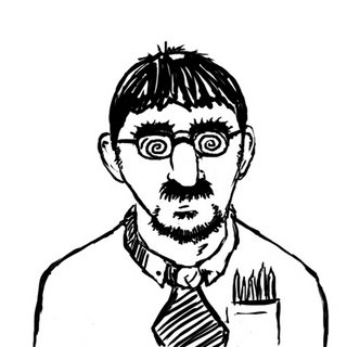
...and I don't think that this blog has a direct link to Barratuna (other than the blurb above your portrait). Unless I missed it.
pretty neat but how is my project coming???
we are heading to snowshoe this afternoon. Almost wish you and the heathens were going
Break a leg for me...jerk...Hey the neighbor teacher has a new program that as soon as he gets done with the training I'm going to tear in to for the website deal. My laptop is dead temporarily so I can't do anything until I get that back...hopefully in the next couple of days.
Make sure if you are going to wreck to hit face first...that away you can use the insurance to get some pre-existing conditions taken care of...maybe they can use you guys as a test case so that they can fix my ugly mug...
being a jerk and being ugly with a trip to snowshoe is better than being a jerk and ugly and living in ohio...I win
Just get moving on this, sooner we get up and running sooner we become rich!
This turned out nice. It all in the details: the cloud of blood from the fish, the spots on the giant fist and it's teeth.
I am an illustrated Man, but I think we have had this discussion in the past. Nice use of combining Vector and pixel based art.
Love the new header here. The details on the fish are tremendous and the perspective makes him appear as though he is the size of a whale! Yikes!
Sorry to inform you we didn't do any face plants this weekend.
Glad you weren't there.
Do you have you laptop back?
No-go on the laptop...I was told I would have it back "in the next couple of days"...they are taking it in tonight...Glad to hear you guys are safe...although it would have been funnier if you had at least broken a leg or something...nothing major...
Looks awesome Brian. Sorry I didn't get to you sooner! I originally had to use a PC as well, for a former header, then I discovered using a differet Browser (Firefox), instead of Safari worked.
Post a Comment