A good thing for an artist to be able to do is create strong mental images of what they are working towards. After this some people follow the process to refine the work and some (more of the fine artists) refine their work 'on the canvas'. Either way it is important to let your work give itself some of the direction. Never be 'married' to a piece so much that you are afraid to let yourself go and try new things. Usually when I talk to an artist about a piece I really like, I hear the same story...The core idea stayed...but as they worked, the image pulled them in different directions...and it always turned out better than their original concept.
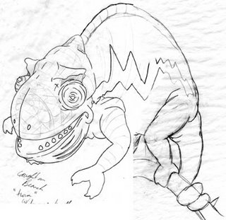
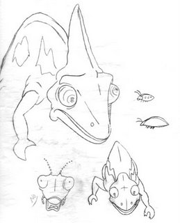
Between working on the computer vs. traditional methods the computer does have one advantage. The undo button. Those working in more traditional methods are sometimes apprehensive about trying new things or trying to experiment on a piece that may get 'ruined' in the process. This apprehension can sometimes move over into the digital arena as well and the work can end up a bit lifeless and overly sterile. Recently viewing an item on IF people liked the sketch more than the digital work. This is because during the sketching phase the drawings usually seem to have more personality and life.
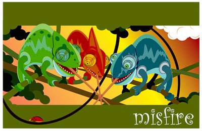
In this piece I had planned on continuing my traditional ways...I had everything laid out and ready to transfer to illustration board...I had a strong image in my mind of what and how I was going to do things...but my coloring hand was begging me to give it a rest. So I went digital. As I was going I noticed several things that didn't transfer well digitally...mostly the legs (but the heads had issues as well). No matter what I did they just didn't have that whimsy that I wanted, so I switched to the current version...I let the work 'breath' or dictate what 'looked' right in the given situation.


9 comments:
Great digital work. I'm new to transferring my sketch and then executing it digitally. Any instructions on how you do this?
I liked your comment about how the sketch is more alive than the finished piece. I thought it was just me - I'm not as intimidated when I think I'm only 'sketching'.
I start off scanning an image in greyscale to photoshop. If using a vector program (Illustrator or Freehand) I keep the dpi between 72-150 depending on the amount of detail in the drawing. If I am painting in photoshop and want the outlines to show through I will keep the item at 3 dpi (the Holocaust poster in November archives is an example). I then will adjust the levels to help get rid of the greys and strengthen the blacks if needed. From there, if I am working in a vector program, I let the drawing tools do some of the corrections. If my sketch has a curve or shape that I have to 'fight' the pen/bezigon tool to trace, then I know my rendering might have a bit of an issue. So I tinker a bit with the tool and give it some freedom to get a 'better' shape...and usually do. I like the heads much better using this method than merely 'tracing verbatum' the sketch.
Mighty nice dinosaurs!
Per your comments about my work: Getting the thumbnail's a bit more involved than it should be. This IF drawing is a recreation of one of my old freelance illustrations. The commissioned version was done rendered as vector art, but the thumbnail sketches are traditional marker-on-paper. I'd have to turn the house upside down in hopes that it didn't get trashed in one of my many moving purges. As a part-time art teacher, I can see why you'd value the process drawings. While the ancient marker thumbnails may be gone, I still have the original published version. Can I send you that, plus the IF pencil (Photoshop) art. Would that help?
this is too funny, what a great illo! love that the ladybug is just going on its merry way with no thought of what just happened. very nice, and I love the bright colors!
COOOL lizard!
Very good
my sketches are always better than the finished item
excellent digital work...I find out your writing very interesting and I think I basically agree w' you about digital "potential"...
i quite like this one--both as a poster design and as character designs.
i suppose this is one example of when tangents in a design are okay.
Post a Comment